Prompting the Tim Burton Art Style, with Examples
 FLORA
FLORA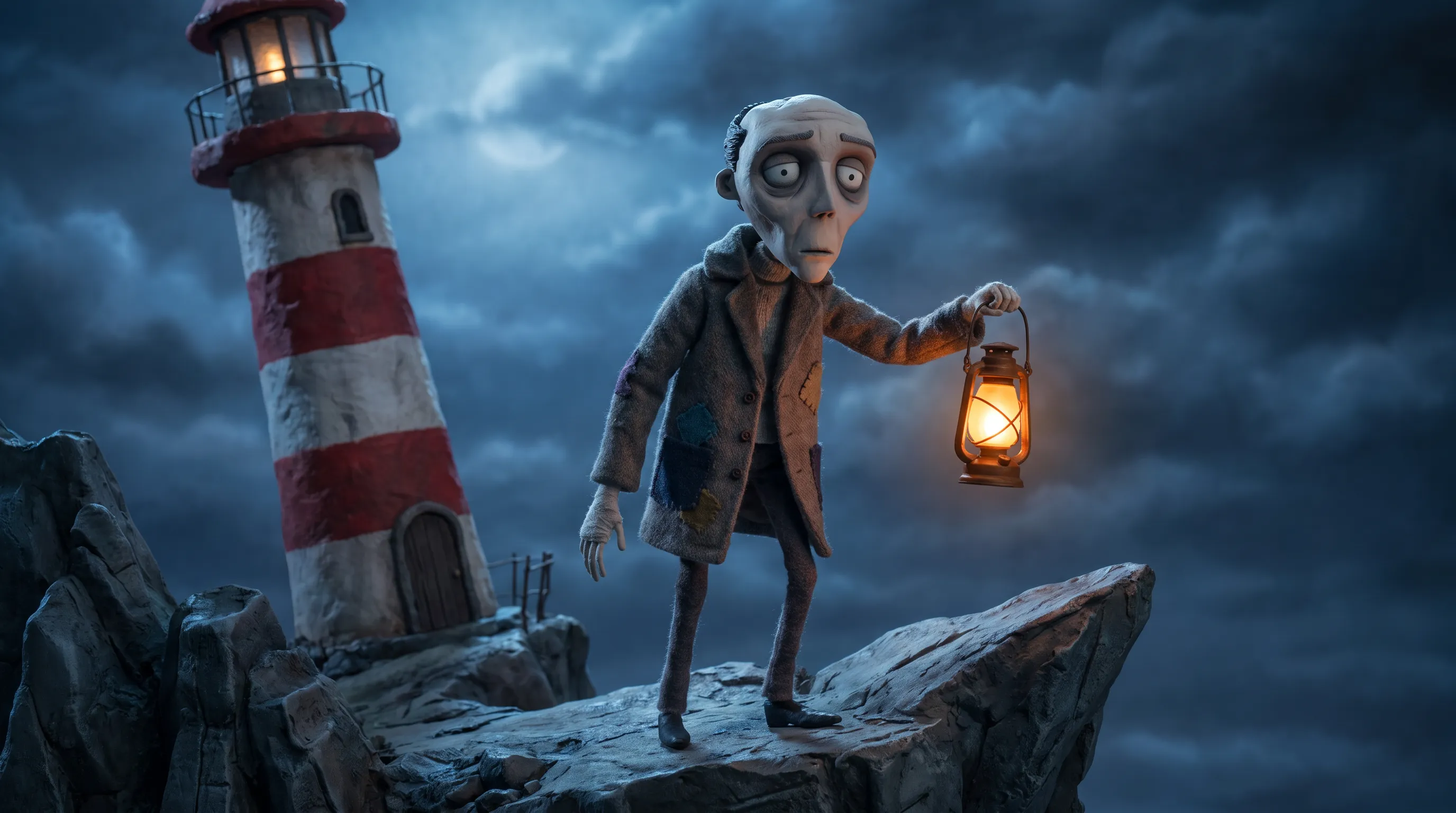
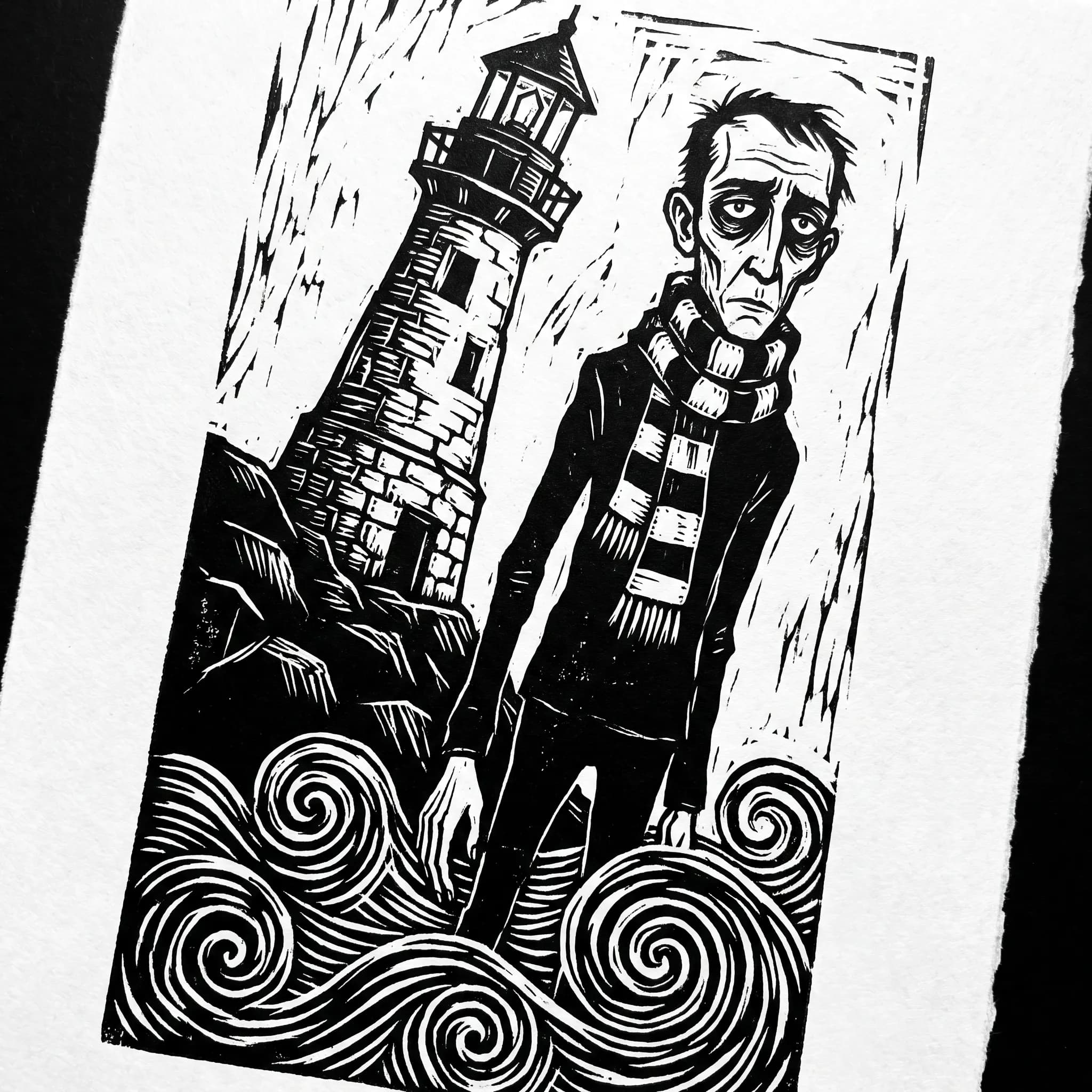
What gets called the Tim Burton art style comes from the American director, who studied at the California Institute of the Arts and animated at Disney before his films made the fantastic and the macabre his trademark. His figures look thin enough to snap, with spidery fingers and heads too heavy for their necks. Faces stay chalk pale while the eyes sink into dark rings. Around them the world leans, houses tilt and hills curl into spirals, and stripes keep turning up on stockings and wallpaper. We generated eight images in FLORA with the AI image generator to show the look holding up across media.
Tim Burton art style examples made in FLORA
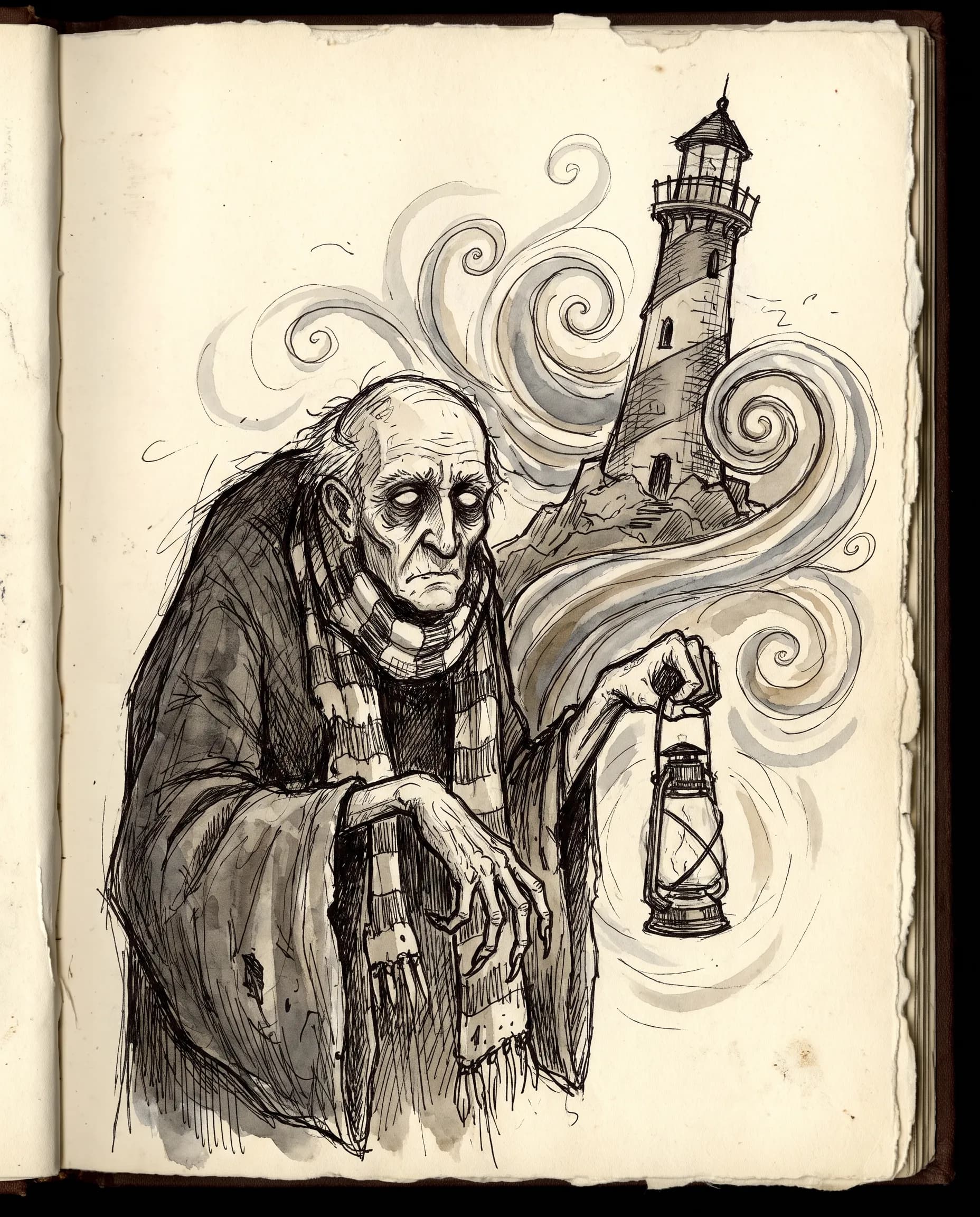
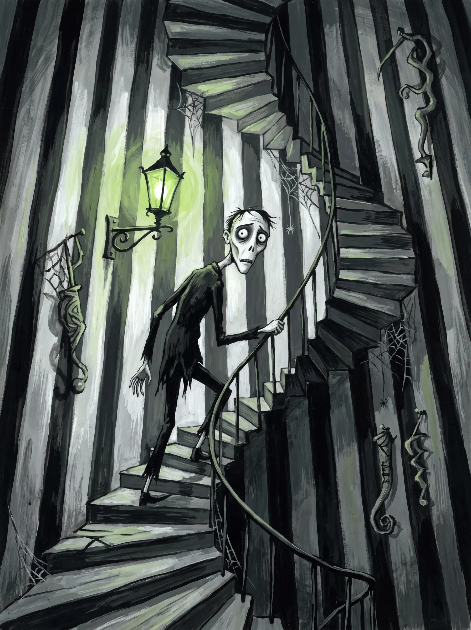
Clay, ink, charcoal, cut paper and four other media all carry one character here, a hunched lighthouse keeper who tends a lopsided tower above a black sea. Below every image sits the prompt that made it, copied word for word.
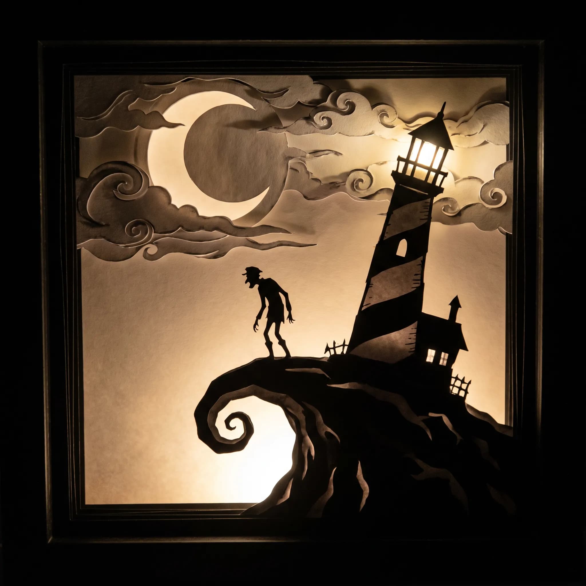
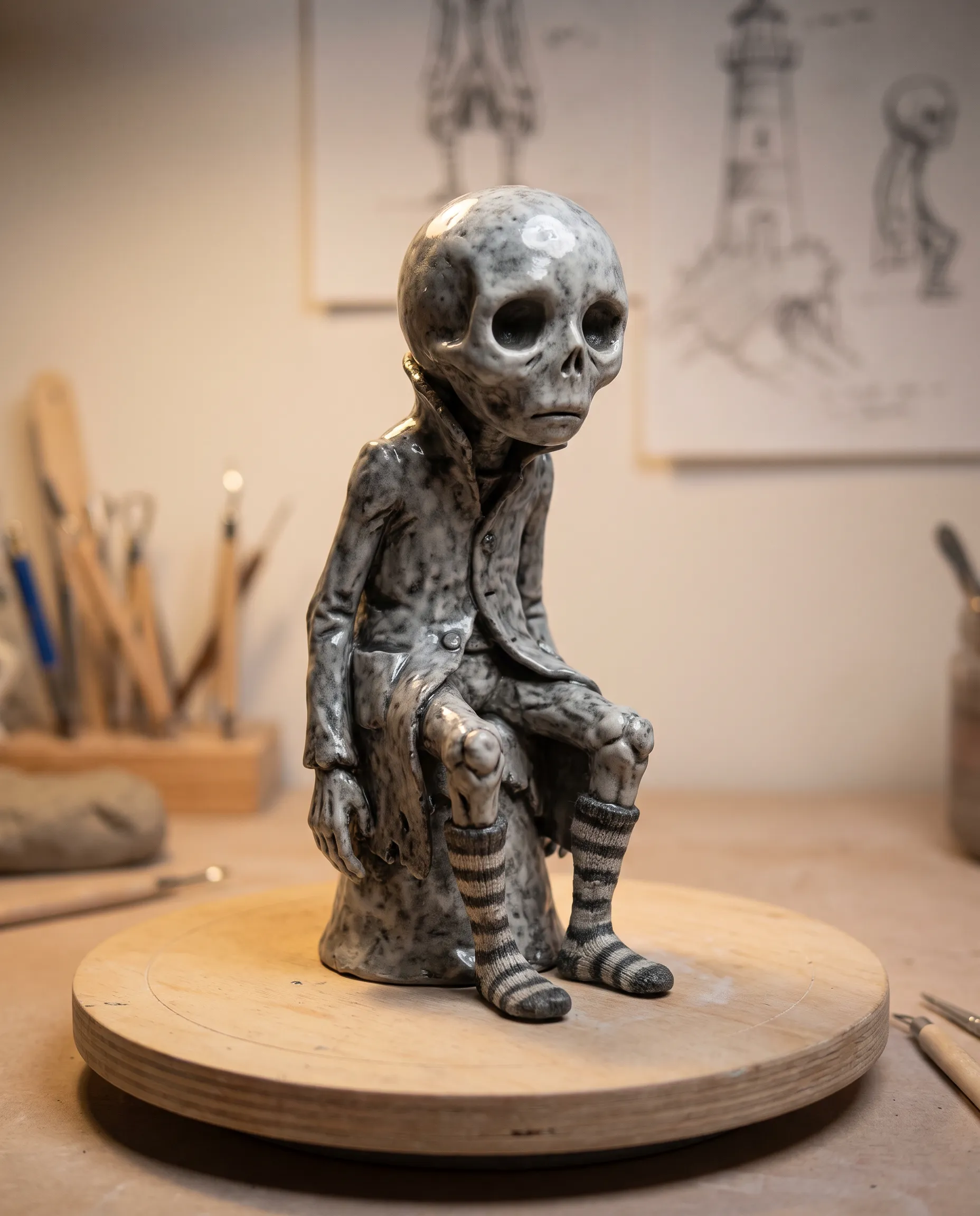
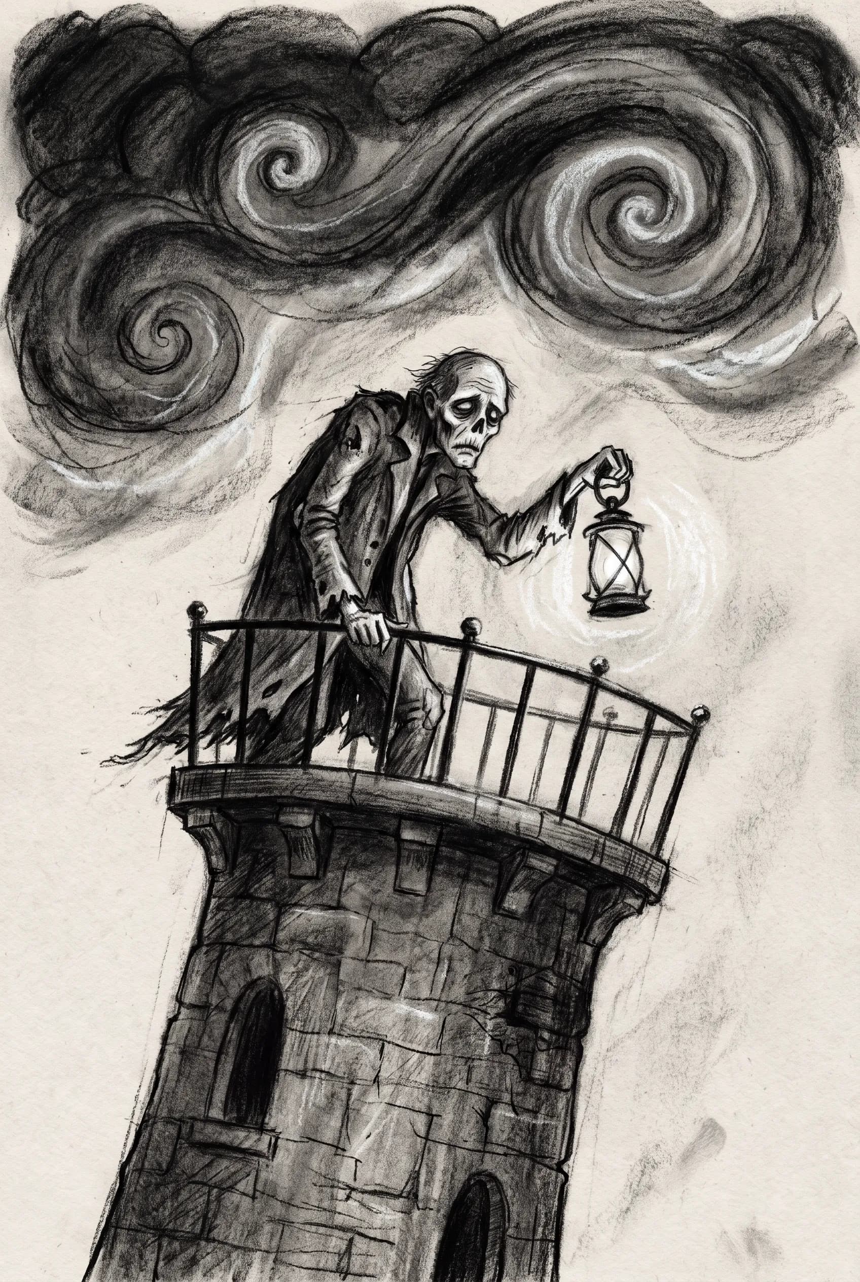
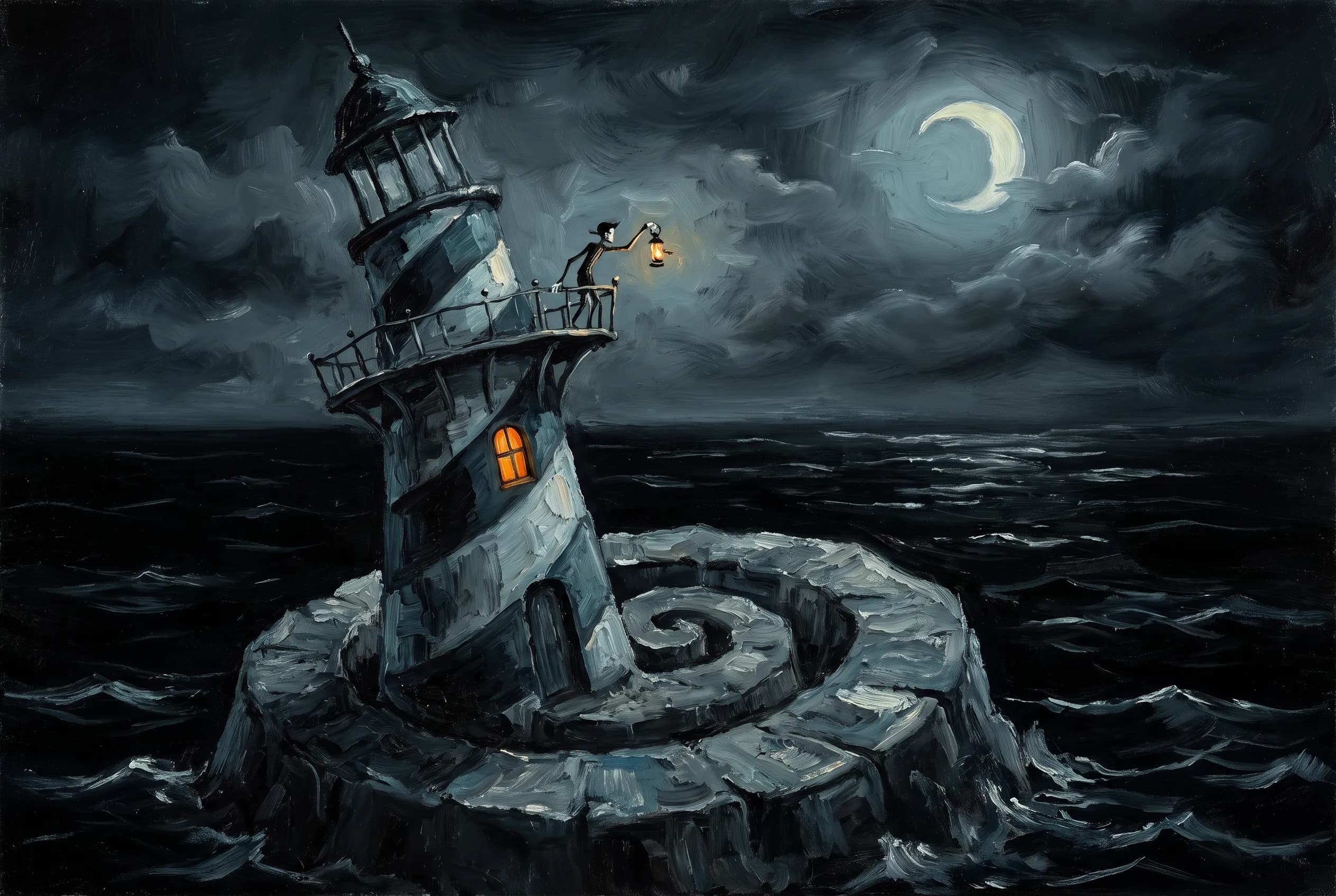
How to prompt for Tim Burton art style
A name is a weak instruction. Ask for Tim Burton style art and nothing else, and the usual result is a Halloween greeting card with bats circling a pumpkin. Proportion carries the look, so describe the body first, asking for a spindly figure with a large head, long fingers and hollow eyes ringed in black. Then tip the world off its axis so doors lean and paths wind uphill. Keep the palette to black, white and gray plus one sour accent such as moss green. The medium sets the texture, since stop-motion clay and scratchy ink read as Burton for different reasons. Light it with one moon or one lantern, because general gloom flattens the scene.
It also helps to choose between his two modes. The sketchbook drawings have a quick, nervy pen line while the puppet films look polished and handmade, so name ink sketch or puppet animation near the start of the prompt.
Copy these three prompts
- Miniature set. Stop-motion puppet of a gaunt lighthouse keeper with an oversized head and spindly limbs on a crooked cliff, leaning striped lighthouse behind him, clay and felt textures, cold moonlight and one warm lantern, in the manner of Tim Burton, no text
- Sketchbook. Scratchy pen and ink sketch of a stooped lighthouse keeper with long thin fingers, sunken dark-ringed eyes and a striped scarf, loose gray watercolor wash, sea spray curling into spirals, sketchbook page, gothic whimsy, no text
- Picture book. Flat gouache picture book illustration of a lanky lighthouse keeper climbing a spiral staircase inside a crooked tower, chalk-pale face, black and white striped walls, a single sickly green lamp, Tim Burton art style, no text
Fixing the usual misfires
Most failed attempts drift toward cute. Ask for big eyes and a model may hand you a glossy toy, so pair the eyes with dark sockets and a gaunt jaw. Straight horror is the opposite slip, and the word whimsical pulls it back. Some models also flood the frame with purple and orange the moment they read gothic, so spell out the gray base. Close each prompt with no text, or a sign covered in nonsense letters will appear on the lighthouse door.
Where Tim Burton art style works
Seasonal campaigns are the obvious home for it. A Halloween shop window or a horror film festival poster wants something spooky that still sells, and spindly figures in leaning houses manage that without scaring anyone off. Turn one reference photo into a board with the Moodboard Maker first, then work from it so the accent color holds across every piece.
Merchandise comes next, because stripes, spirals and pale faces survive being printed small in one color. Write a print brief for apparel in Design a Shirt, and describe the character once to get a base pose, six expressions and a cover from the sticker pack generator.
Game and animation pitches gain a point of view from it as well. Photograph a real street and redraw it with the photo to drawing guide. Prompt the result crooked and moonlit, and a location scout becomes concept art in an afternoon.
Related styles
- Emo art style keeps the pale skin and dark eyes and swaps the fairy tale for teenage heartbreak
- Rubber hose art style bends noodle limbs the cheerful way, a useful contrast
- Cartoon art styles covers the wider family of exaggerated proportion
- Cute art styles puts big heads on small bodies and removes every shadow
FAQs
What type of animation does Tim Burton use?
Mostly stop-motion. Puppets are posed and photographed one frame at a time. He created the concept and general design for The Nightmare Before Christmas (1993), which Henry Selick directed, and in 2012 he directed a stop-motion remake of his own Frankenweenie. Corpse Bride (2005) earned an Academy Award nomination for best animated feature.
What is the Tim Burton aesthetic called?
MoMA's 2009 exhibition of his work, which gathered more than 700 drawings, puppets, storyboards and other pieces, described him as an artist working in the spirit of Pop Surrealism. In fan writing and online guides, the usual word for the look is gothic.
Why is Tim Burton gothic?
His stories keep returning to the macabre. One of his first shorts, Frankenweenie in 1984, was an homage to horror movies. Later features adapted Washington Irving's The Legend of Sleepy Hollow and Stephen Sondheim's Sweeney Todd. He has since directed episodes of Wednesday, a comedy-horror series inspired by The Addams Family.