What Makes the Marathon Art Style Look So Graphic
 FLORA
FLORA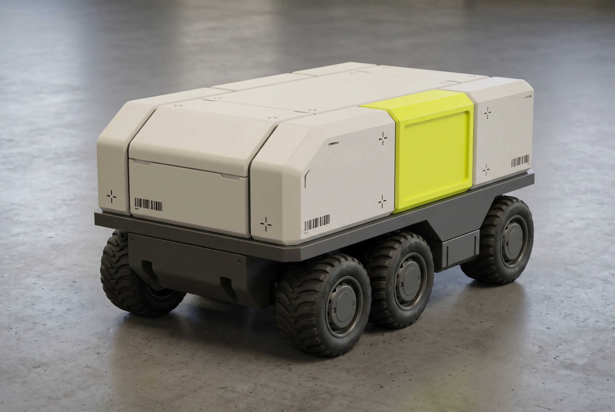
The Marathon art style is the look of Bungie's 2026 shooter Marathon, the first new game in the series since Marathon Infinity in 1996. Art director Joseph Cross has named the design studio The Designers Republic and the game Wipeout among the team's influences, along with the manga artist Katsuhiro Otomo. Objects are pared down to simple hard-surface shapes, yet they keep realistic scale. Plain, matte surfaces get cut by flat blocks of highlighter yellow and pink. Materials stay few, and barcodes and print registration marks cover walls and gear like freight labels.
Marathon art style examples made in FLORA
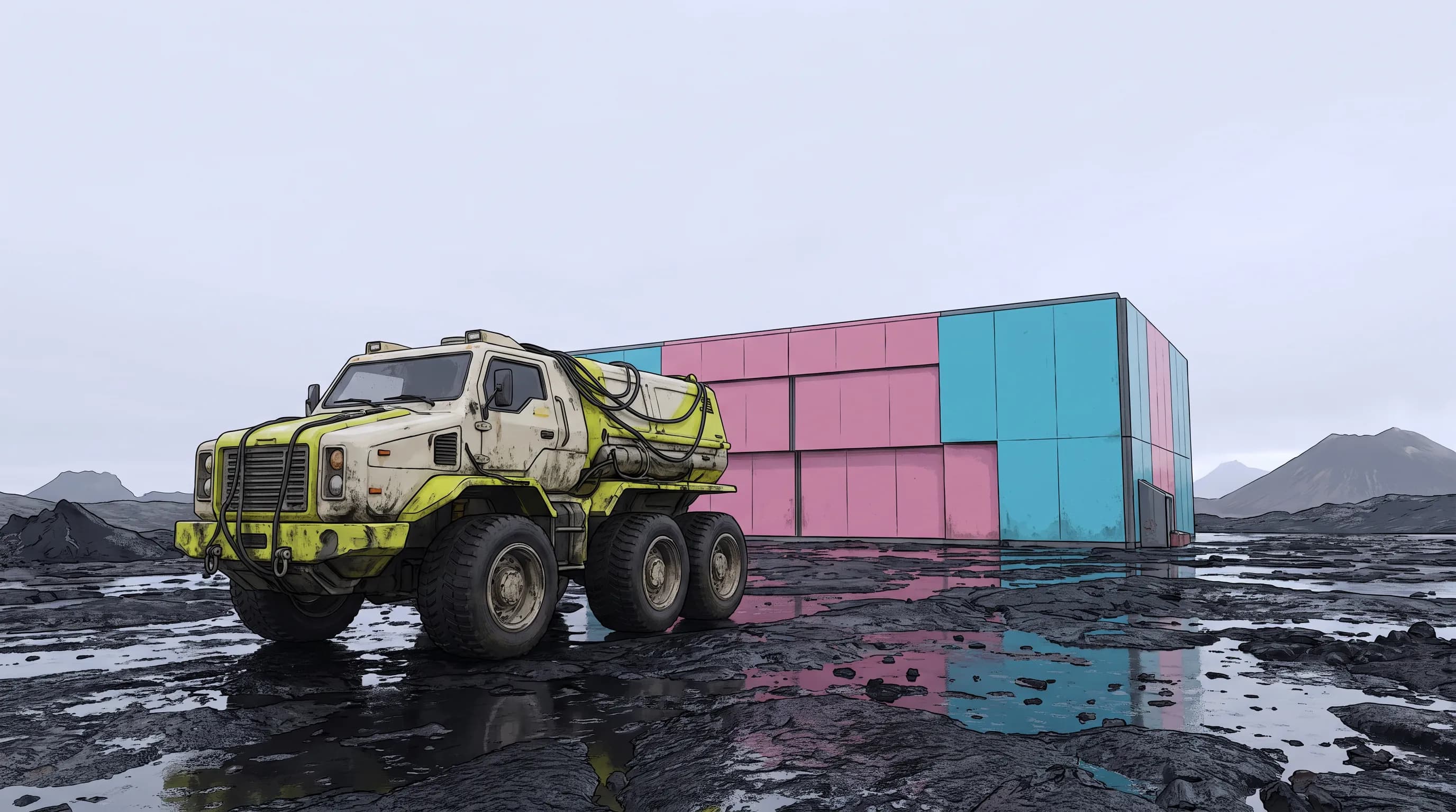
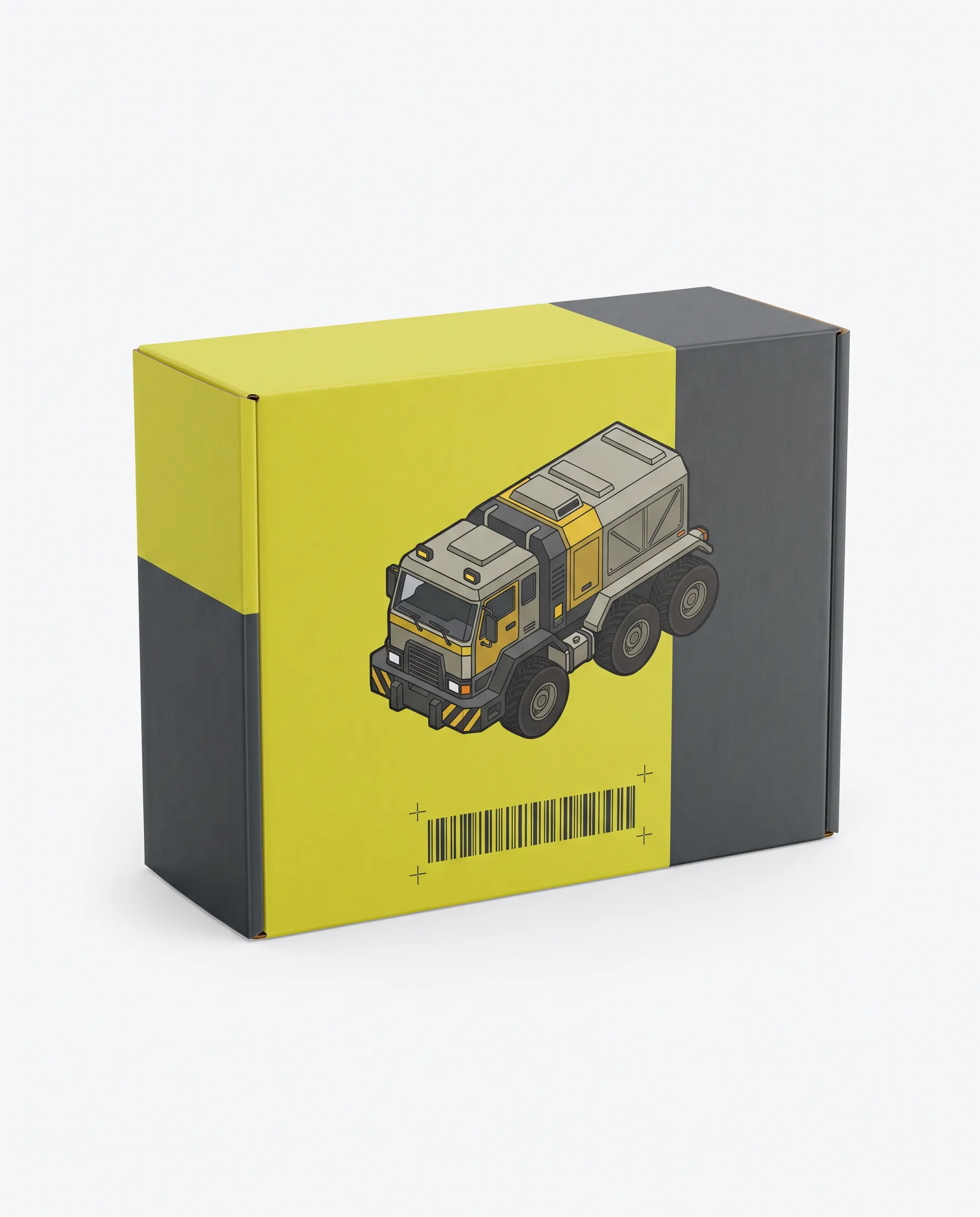
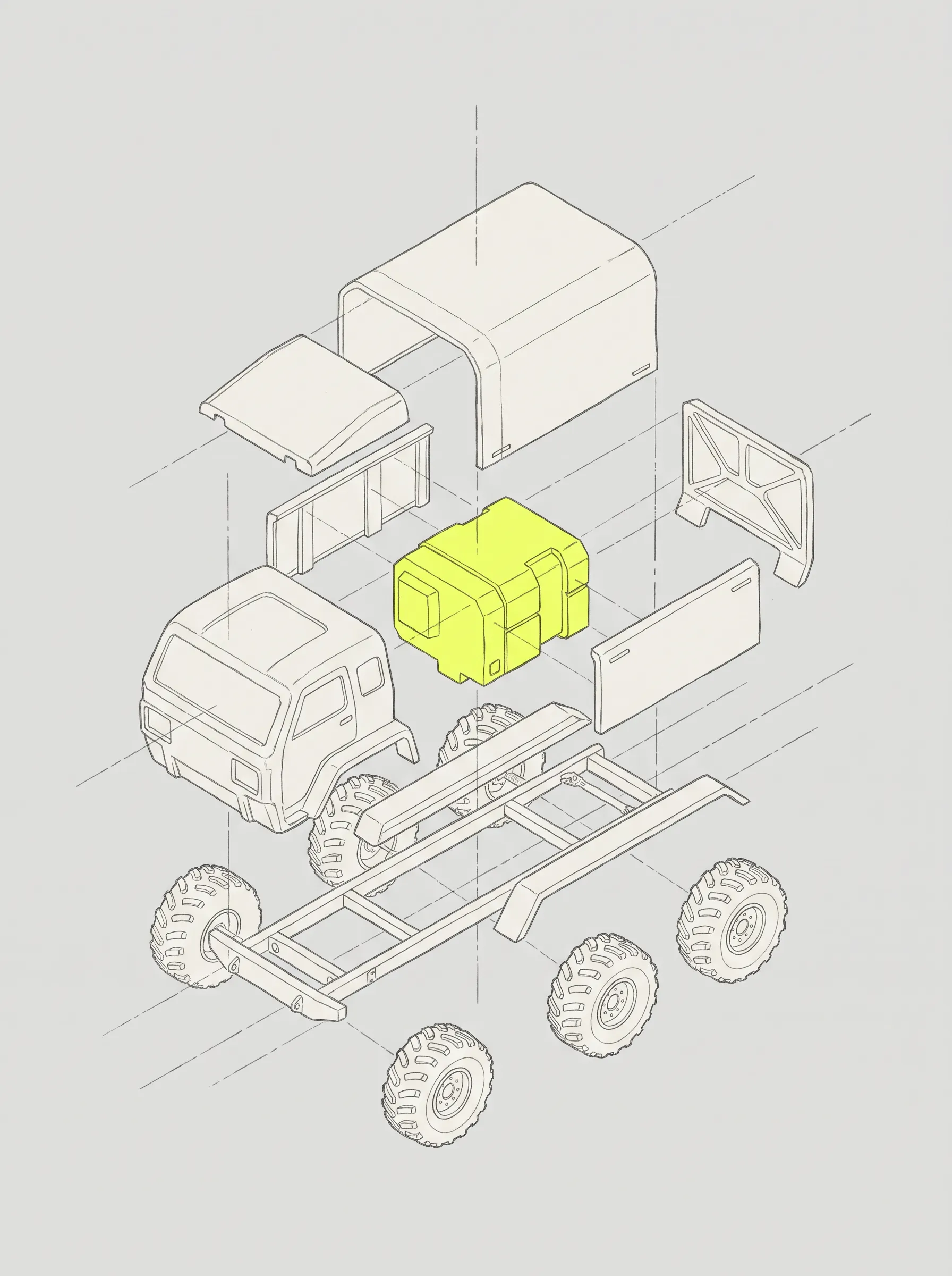
An invented six-wheeled cargo tug, the squat kind that hauls crates around a supply depot, appears in all eight pictures. Nothing from the game made it in. Each image came from FLORA's AI image generator, with its full prompt printed beneath it.
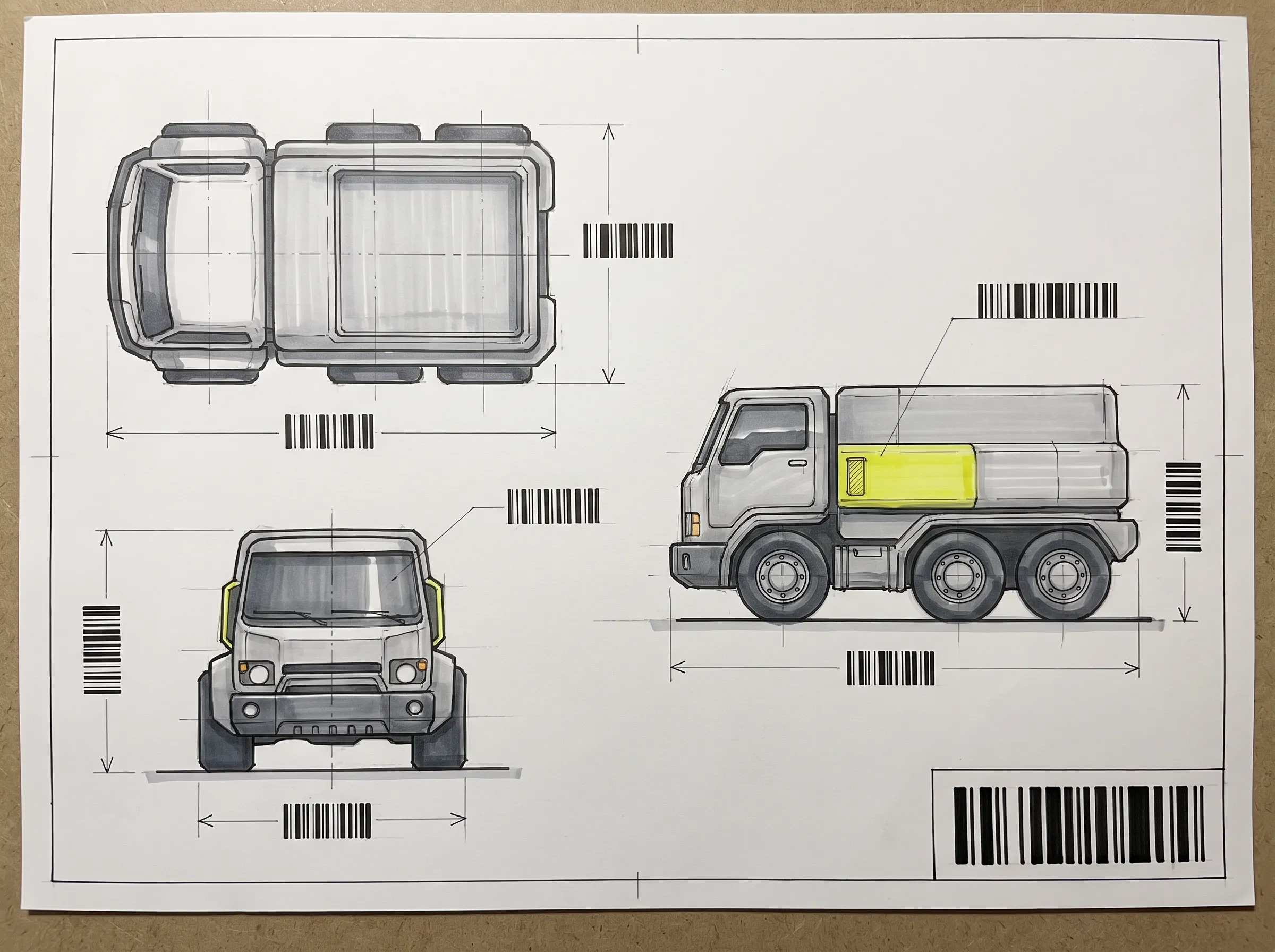
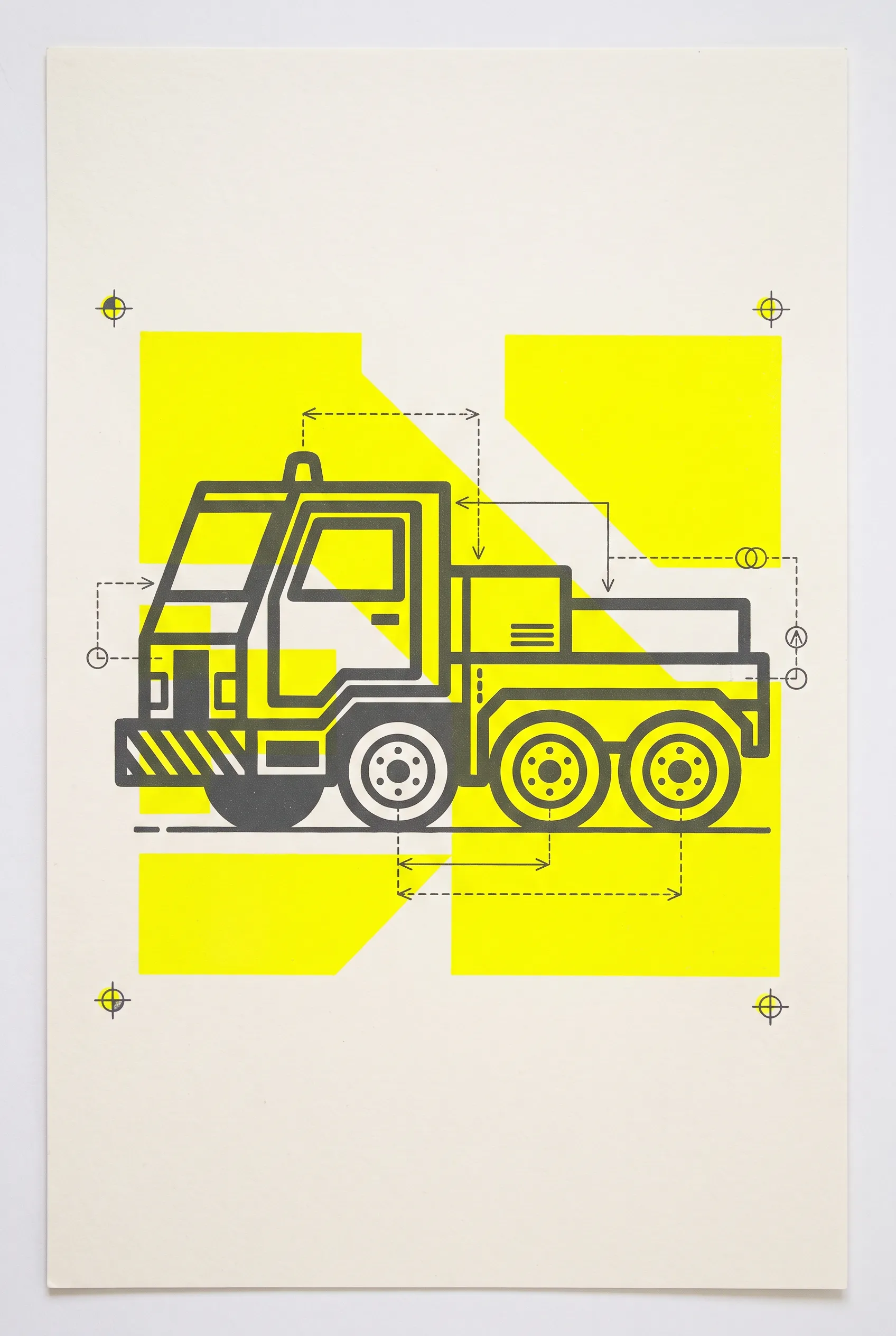
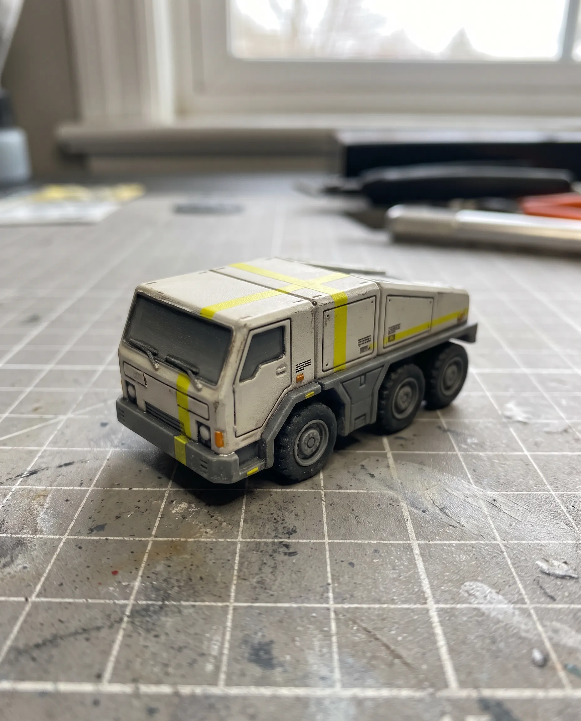
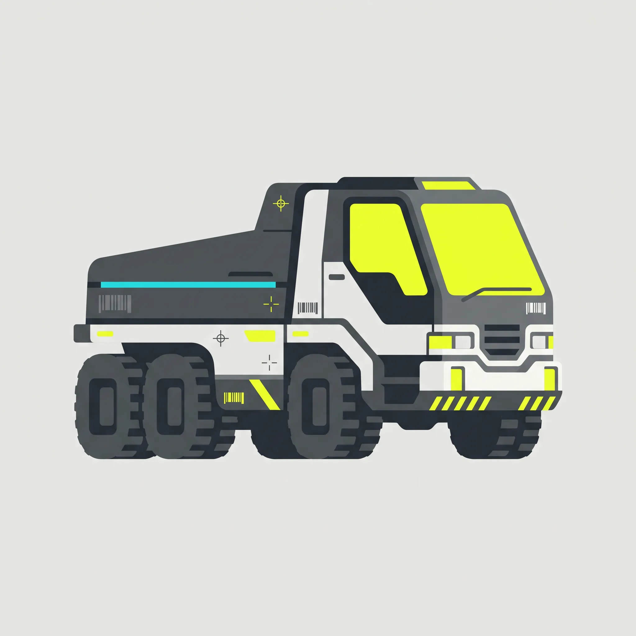
How to prompt for Marathon art style
Begin with the color split, since the whole look rests on it. Give the body one quiet neutral such as bone white or graphite, then name a single loud accent and say where it goes, perhaps one side panel or the wheel hubs. Describe the subject as an industrial designer would, with chamfered edges and panel seams at a size you can read against a crate. Barcode strips and crosshair targets come next, and calling them abstract marks helps keep real words off the hull. Plain light suits it, because soft overcast daylight keeps flat color flat.
Ground matters more than it seems. Marathon's maps set clean machinery on shiny black rock, which reminded Eurogamer's Christian Donlan of the years when Hollywood space films went to Iceland for their distant worlds. A rough dark ground under a smooth bright machine is easy to borrow for wide formats.
Three tug prompts
- Studio render. Hard-surface 3D render of a squat six-wheeled cargo tug, graphic sci-fi design, matte bone-white body panels, one highlighter-yellow side panel, graphite chassis, chamfered edges and clean panel seams, small black registration crosses and barcode-like stripes as abstract marks, realistic industrial scale, limited materials, soft overcast studio light, no text
- Screen print. Two-color screen-printed poster of a squat six-wheeled cargo tug in side profile, flat highlighter yellow and graphite ink on off-white paper, bold geometric color blocks, thin technical rules and registration crosses, generous empty space, Marathon art style, no text
- Landscape. Wide digital matte painting of a squat six-wheeled cargo tug parked on shiny black volcanic rock, bone-white and acid-yellow body under a pale overcast sky, flat-pack hangar behind it with pink and cyan color-block walls, realistic scale, calm graphic composition, no text
When realism creeps back
Bungie made this trip in reverse. Cross told the Learned Squared podcast that the team first chased high-fidelity realism before switching to a simpler graphic approach, which he called the biggest art direction change on the project. Image models often drift back toward that first plan and pile on rust and grime. Writing limited materials and clean matte panels into the prompt usually holds the line.
Where Marathon art style works
Hardware concepts are the obvious fit for a look this preoccupied with manufactured things. Draw an e-bike or a drone on paper and run it through AI Sketch, which turns a rough product drawing into a photoreal render, inked line art, two colorways and a short reveal clip. Write one colorway as bone white with a yellow accent and the other as graphite with pink to test how far the accent carries.
Donlan also likened some of the game's two-story orange structures to cheery skincare packaging. Color-blocked cartons stamped with codes look at home in this world, and AI Packaging Design takes one product and returns a hero carton, a photoreal retail shelf render and a matching SKU lineup.
MotoGP and Formula 1 made Cross's list of inspirations as well. Racing livery is a handy model for an event poster or a team kit, one loud color on a quiet body.
Related styles
Cyberpunk art style moves sci-fi onto rainy streets at night, and graphic art styles covers the print-design traditions this look borrows from. For another game look, try the inked Borderlands art style or the wider set of video game art styles.
FAQs
What is the art style of Marathon called?
Bungie calls it graphic realism. Cross has explained that the name is an in-house production term, and he described the goal as a visual brand of science fiction that feels fresh and holds up over time.
What kind of genre is Marathon?
A multiplayer extraction shooter, played in first person, mostly against other players. You play a Runner, a mercenary in a biocybernetic shell. Each match drops you onto Tau Ceti IV to grab loot and get out. Fail to extract and you lose that loot along with the gear you brought. The game launched on March 5, 2026, for PlayStation 5, Windows and Xbox Series X/S.
What was the Marathon art controversy?
In May 2025 the Scottish artist Fern Hook, known as Antireal, posted comparisons between Marathon's in-game designs and work she had published in 2017, saying Bungie had used it without her permission. Bungie said a former employee had added her designs without the company's knowledge and began reviewing the game's assets, and Hook said in December 2025 that the matter had been resolved to her satisfaction, and when the game launched in March 2026 its credits listed her as a visual design consultant.