Brand
MOONReserve
Product
1L gable-top oat milk carton
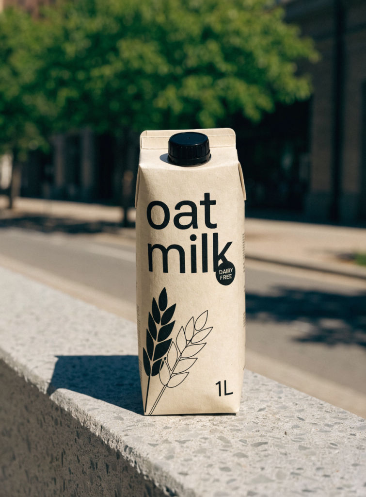
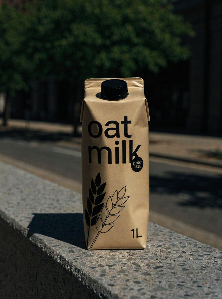
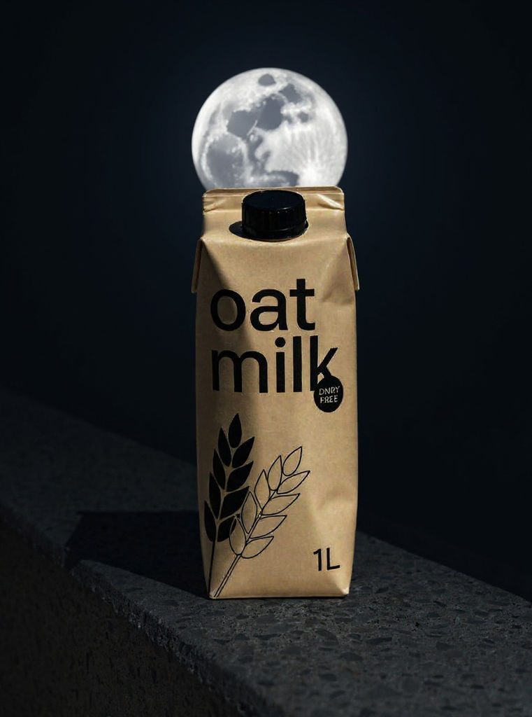
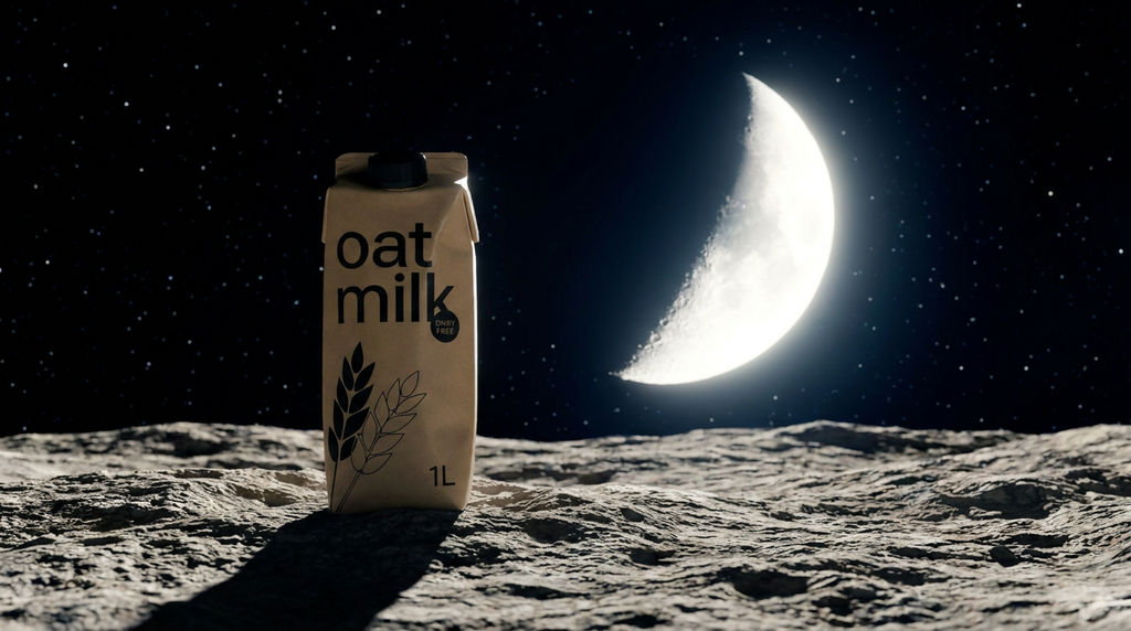
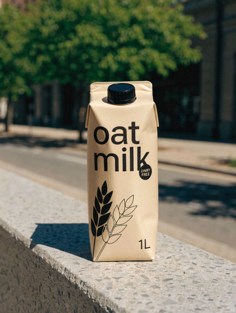
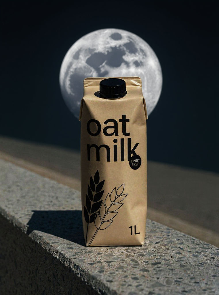
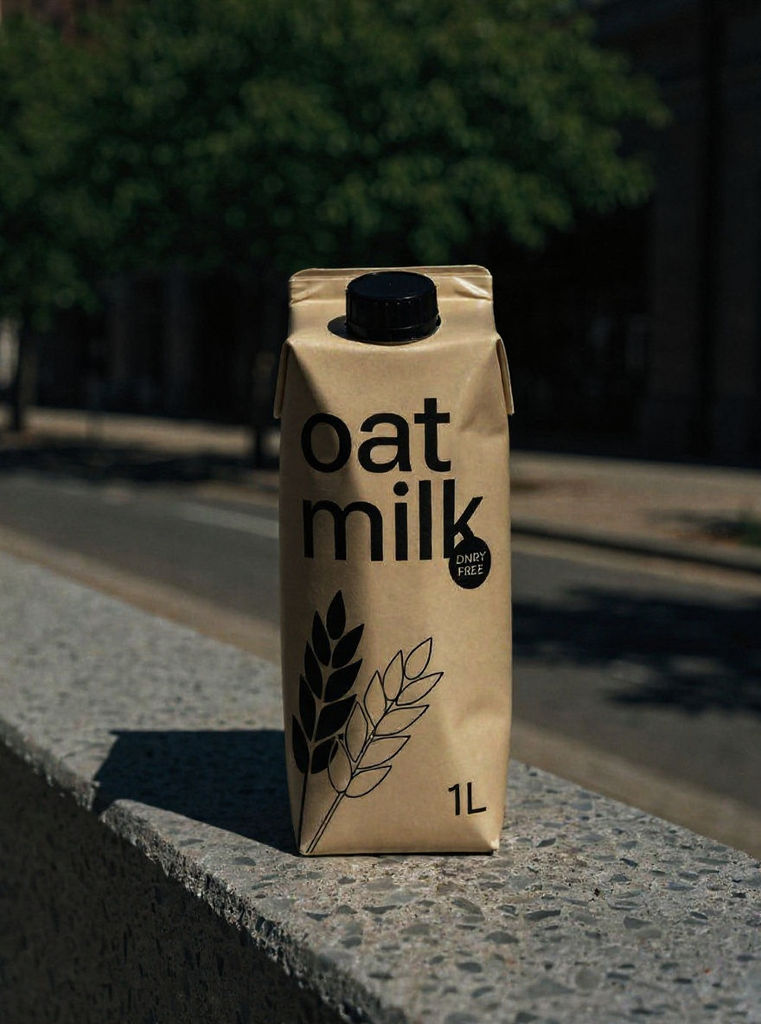
Start with your product and get a hero carton, a photoreal retail shelf render, and matching variants for the whole range.

Early-Stage CPG Brands
Founders get a hero carton and a retail shelf render to show buyers and investors before paying for a physical sample run.

Packaging Design Studios
Studios generate carton concepts and a full variant lineup early in a pitch, then move the chosen direction to the FLORA canvas for refinement.

Range and SKU Extensions
Brand teams planning new flavors or sizes use the variant lineup to check that each SKU still reads as part of the family before anything goes to print.
How to use Techniques?
Discover how to utilize AI Packaging Design for different scenarios.
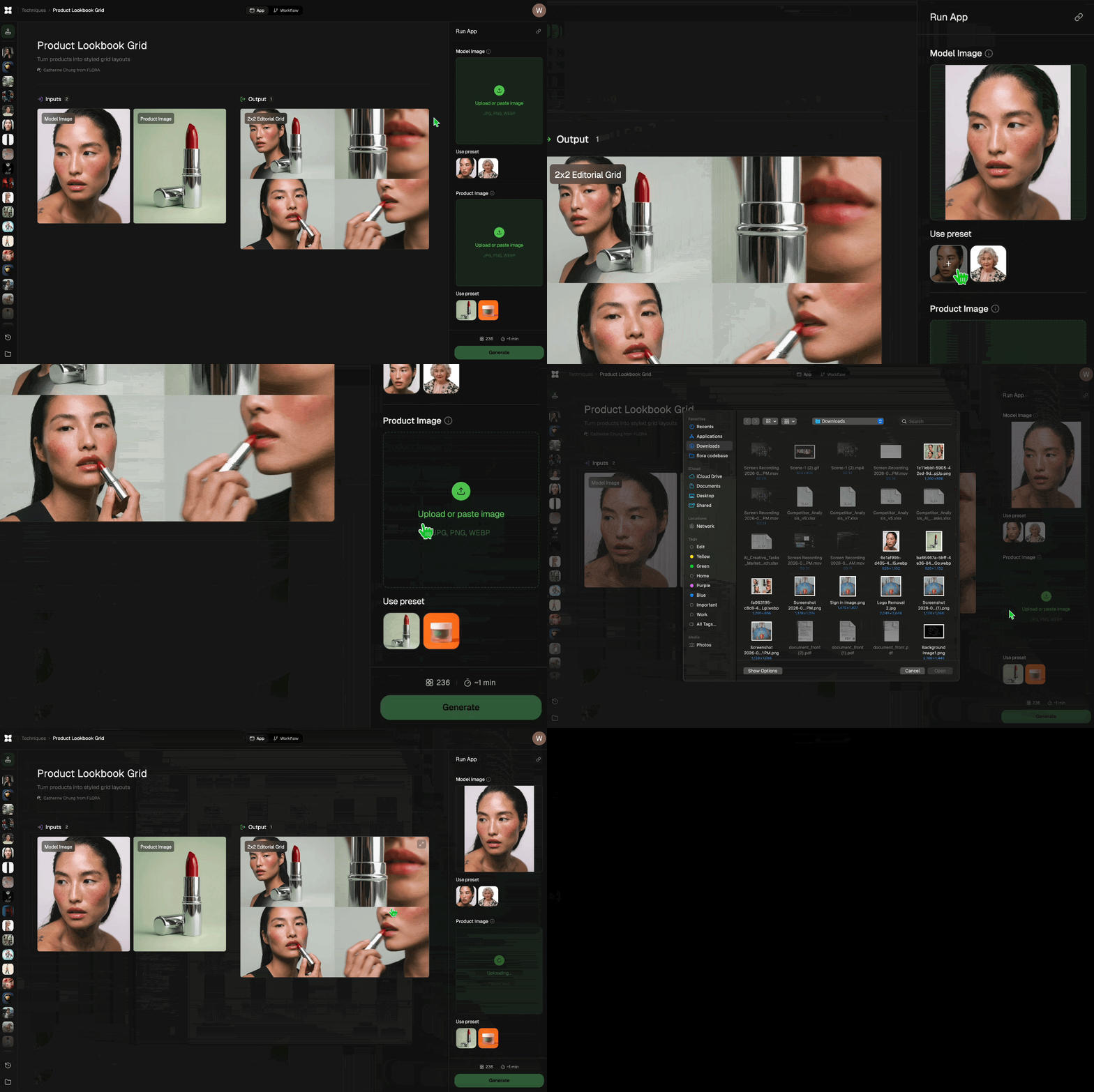
Add inputs
Upload images, videos, or type in the prompts to get started.
Generate outputs
Next, hit the "Generate" button to start generating your outputs.
Edit and export
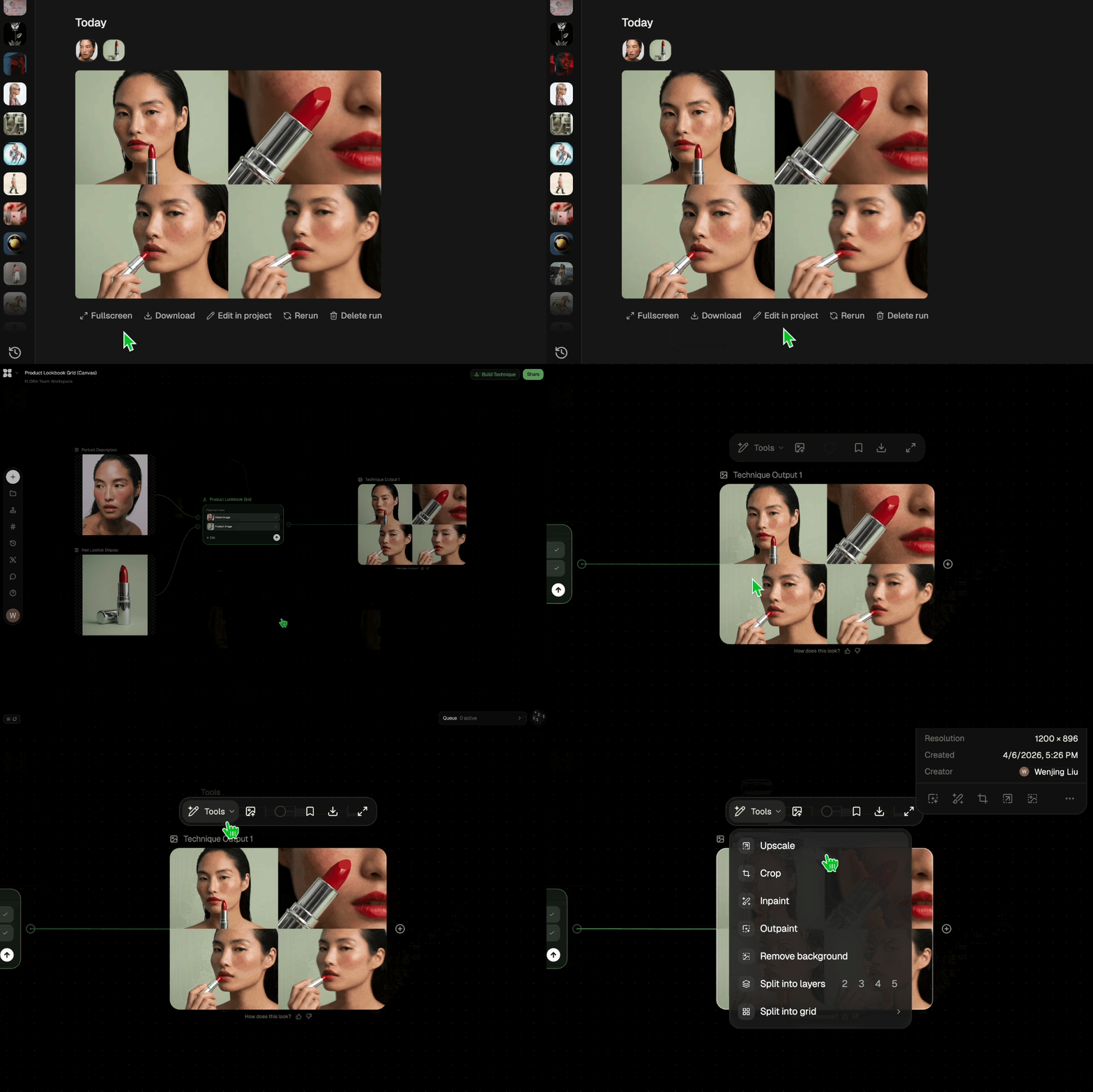
Refine your outputs on canvas, or download them directly.
Frequently asked questions
All you need to know about AI Packaging Design
How AI packaging design gets from one product to a full shelf
AI packaging design takes a single product and produces the set of visuals that packaging work usually starts with, including a hero carton, flat label art, a render of the pack on a retail shelf, and a lineup of variants that share one brand system. The FLORA Technique on this page builds that set from your inputs, which means early packaging decisions can be made before a sample has been commissioned or a studio booked.
For a founder, that makes it possible to show a retail buyer real concepts with nothing more than a product and a rough sense of the brand. Studios mostly feel the difference during a pitch, since presenting several directions to a client has traditionally meant several rounds of mockups. You can try it from a free account on FLORA, and the results land on the canvas so you can keep working on them there.
Designing across every panel of a carton
A carton has six panels, and a shopper rarely sees more than two of them at once. The front panel has to identify the product from a distance. Side panels pick up the information the front had no room for, and they're often what faces the aisle when stock is shelved sideways or stacked in an end-cap display. The back carries ingredients, instructions, regulatory text, and the barcode. Top and bottom panels are largely structural, though the top is what people see first on a low shelf or when they open a shipping case.
Packaging design has to account for all of those panels at once, and folding creates problems a flat layout never shows. Type that wraps from the front onto a side panel should break at the fold instead of running across it. A color block that sits nicely on the flat artwork can look off-center after the box is assembled. Because the Technique shows its hero carton as a finished box, you can check how the panels relate to each other before settling on a direction.
For a label on a bottle, jar, or can, where there is no box to design, Design a Product Label is the more focused Technique.
Why the shelf render is the output to judge first
The hero carton is the most finished-looking image in the set, but the shelf render is usually more informative. Packaging is seen in a row of competing products from a few feet away, usually at an angle and under store lighting. A pack that looks calm and premium on its own can get lost in that row, and a render is a much cheaper place to discover that than a store after launch.
The main thing to check in the render is brand blocking. When several facings of one product sit next to each other, their shared color and layout combine into a larger shape that shoppers pick out before reading any text. If your packs blend into the surrounding products, the usual fix is a stronger dominant color or a bolder front panel, and at this stage trying that costs you one more run.
Building a SKU family that reads as one brand
Even single-product launches tend to become ranges. A snack brand might launch with three flavors, and a skincare line that begins with a cleanser will often add more products within a year or two, each of which needs to look like part of the same line.
To keep a range consistent, decide early which elements are fixed and which can vary. Logo placement, typeface, layout grid, and the position of the variant name usually stay the same on every SKU. Color is the most common variable because shoppers can use it to tell flavors apart at a glance, and some brands also vary imagery or illustration style. When you review the variant lineup, confirm that the fixed elements match across every pack, then check whether the variable elements are different enough to tell products apart from shelf distance.
Each run is independent, so a set generated later for new flavors won't automatically match the first one. Choose the lineup you want to use as the reference and adjust later variants to fit it on the canvas. Product Recolor can create new colorways of an approved pack without regenerating the design, and Palette Pull is useful if you want variant colors taken from a particular reference image.
Writing inputs that steer the result
The Technique has fixed settings, so your inputs are the only way to influence what it produces, and generic inputs usually lead to generic packaging. The details worth including are the ones a packaging designer would ask about at the start of a project, such as what the product is, its category, its target price point, the box or container it ships in, and how the brand should feel. Naming the category is especially useful, because a word like "premium" points to very different design choices on a chocolate bar than on a bottle of shampoo.
If you can provide a visual reference, a mood board of packaging you like gives the Technique a clearer direction than a description alone. Moodboard Maker can help you put one together before running the packaging Technique, which is helpful when the brand identity is still being worked out. Running the Technique two or three times with slightly different inputs gives you several directions to compare, and at the concept stage that comparison tends to be more valuable than refining the first result.
Where the concept stops and production starts
An AI packaging design generator is most useful early on, while you are choosing a direction and testing it in context and changes are still inexpensive. Production has separate requirements. Your printer or packaging converter will provide a dieline for the exact carton size and board, and the final artwork has to be built on that dieline with bleed and safe areas, with any finishes such as foil or spot varnish on their own layers.
Some AI packaging design software also handles production, offering dieline libraries and print-ready export. This Technique is meant for the earlier concept stage. Its cartons follow real box structure, so they are reliable for judging proportions and panel layout, but the production files will still need to come from a designer working to your printer's specifications once the direction is agreed.
What to do with the outputs next
After you pick a direction, the outputs are often reused for sales and launch material. The hero carton can stand in as a product image while samples are printed. The shelf render is especially useful in a deck for retail buyers, since one of their first questions is how a new product will look beside what they already stock.
Product Lookbook Grid arranges a finished range into one layout for a line sheet or pitch. For launch content, Product Animator can add motion to the pack for social posts, and the broader AI image generator can create lifestyle scenes showing the packaging in use. Everything stays on the same FLORA canvas as the original outputs, so the packaging concepts and the assets made from them are kept together.
Related techniques
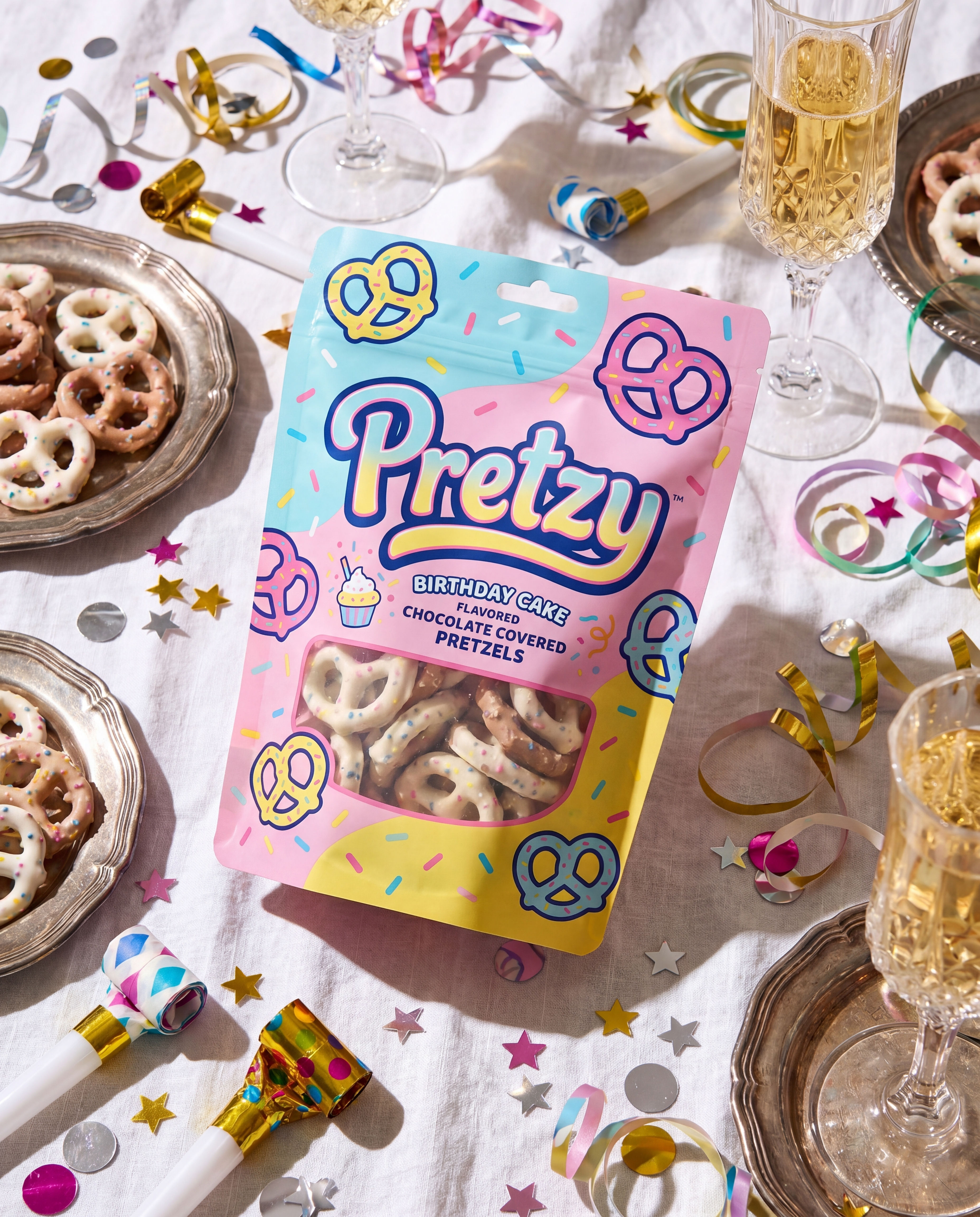 Product in Scene GeneratorCreate User Object Interaction (UOI) images of your product that can be used for e-commerce!
 Storytelling EngineIt takes a single approved key visual and instantly builds out a cohesive 9-frame editorial campaign treatment
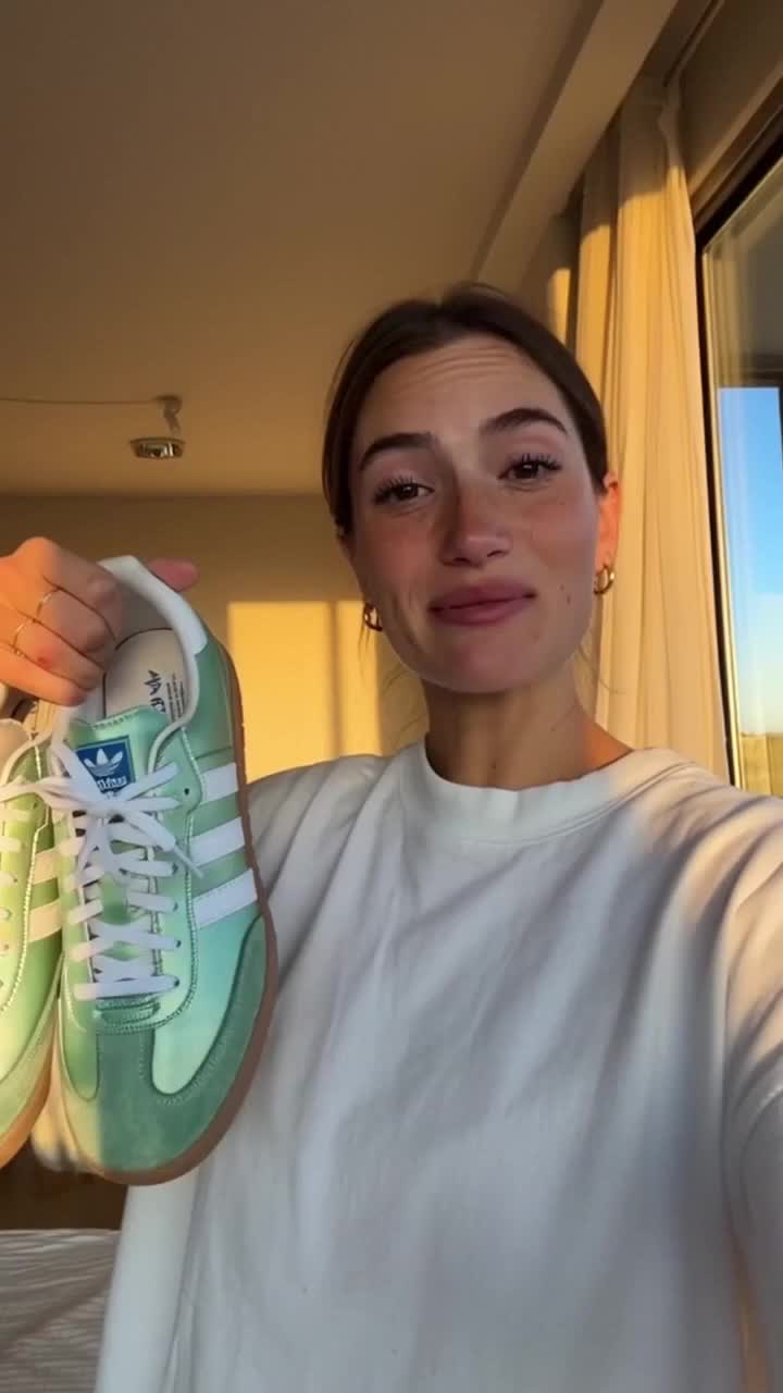 UGC CreatorCasual, phone-shot clips of your product
 Memoji MeTurn any face into a custom memoji
 RelightingRelights your photo
 Character LockOne character, 6 different angles
Turn One Product Into a Full Packaging Line With AI Packaging Design
one hero carton, then a photoreal shelf + a full SKU family that all read as one brand. Useful for: CPG founders, packaging designers, and brand studios who need mockup-quality packaging concepts (label art, dieline-accurate cartons, retail shelf renders, and a variant lineup) without a photo studio.

Louis Anderson