Brand
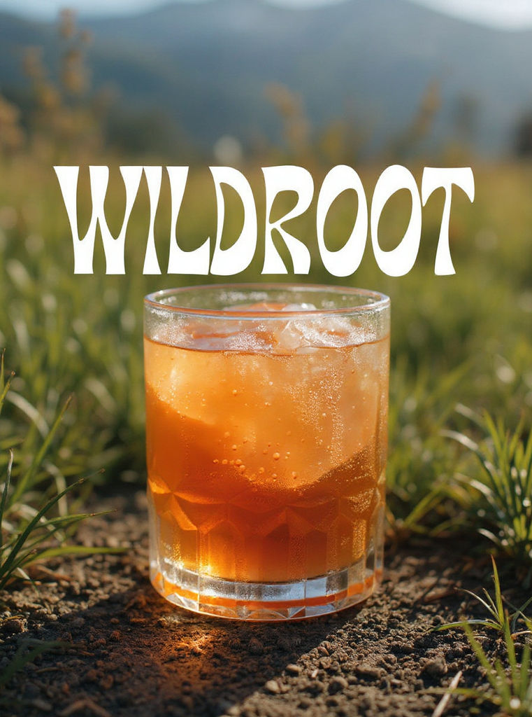
WILDROOT
Crest
a fine engraved botanical crest of a hummingbird over crossed ginger stems
Tagline
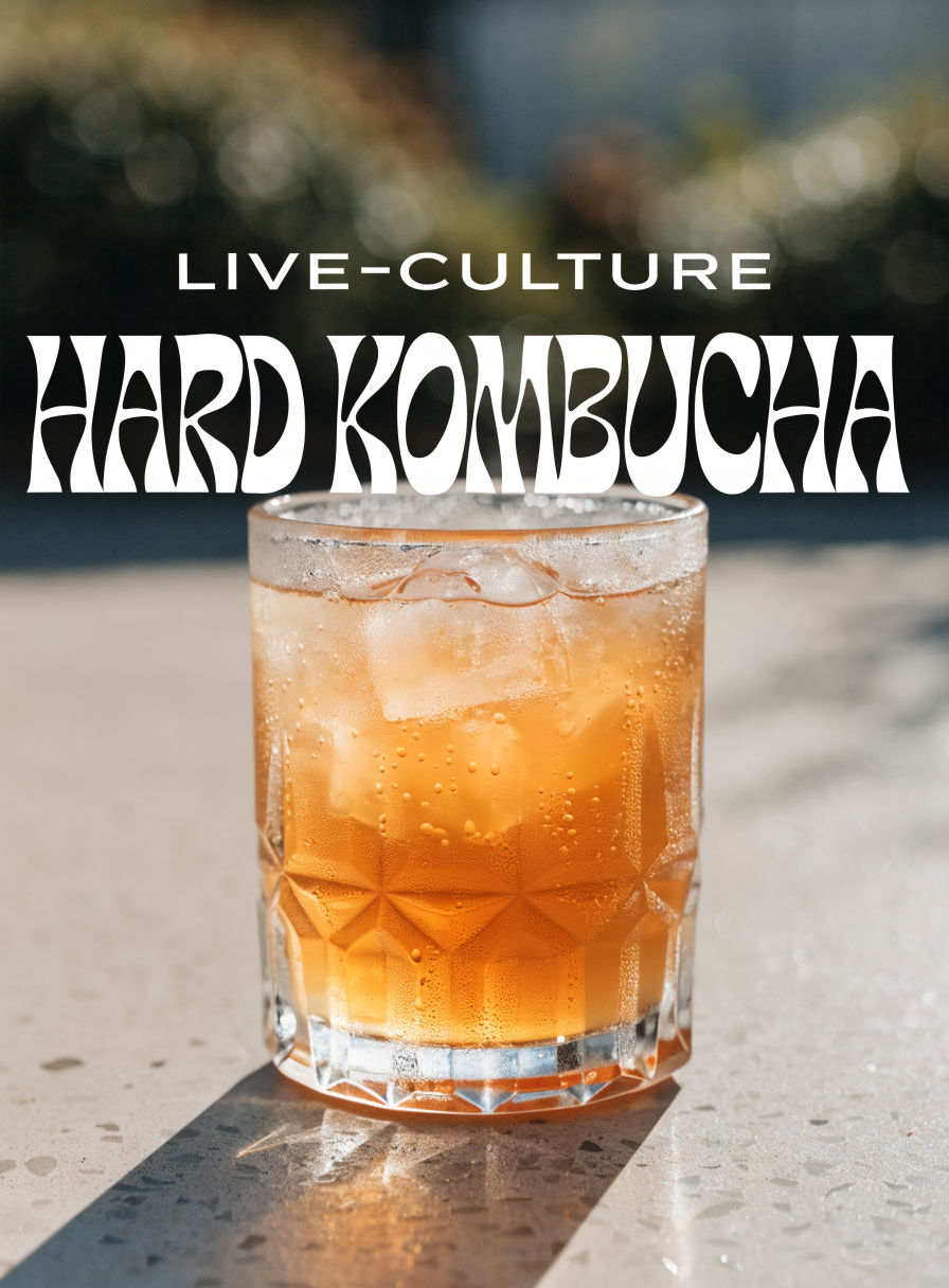
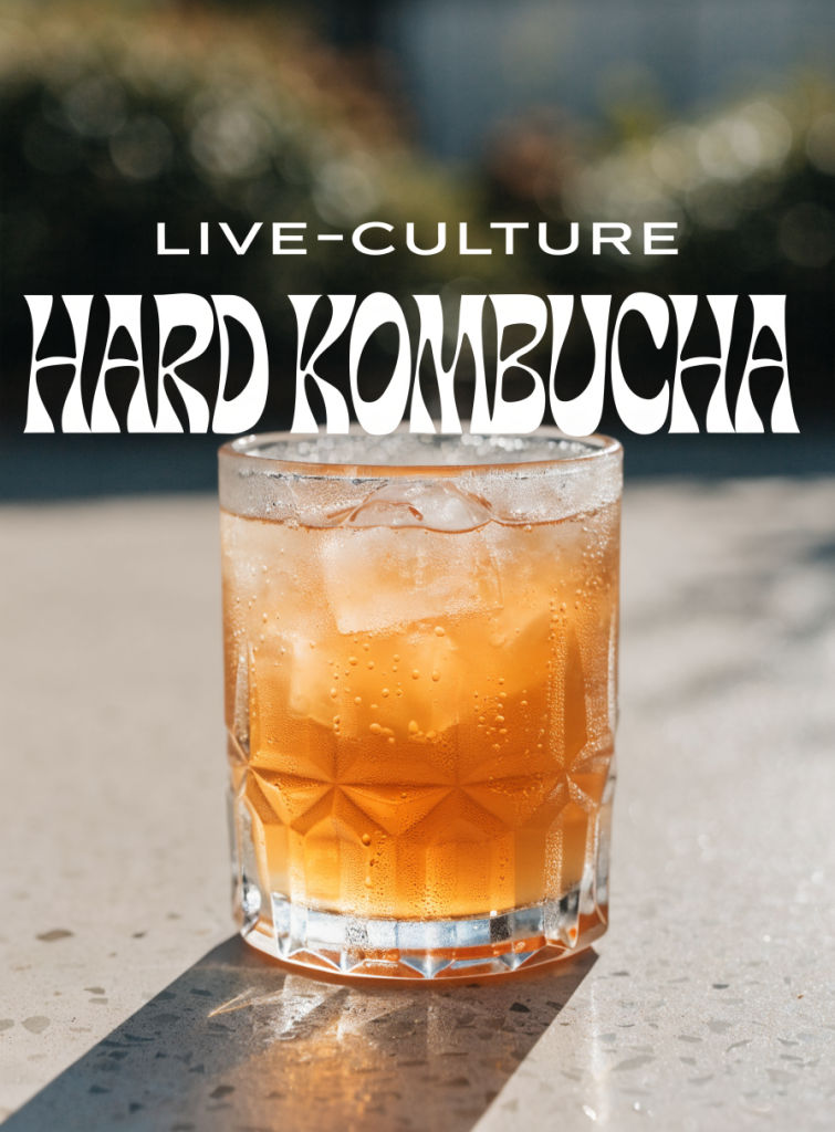
LIVE-CULTURE HARD KOMBUCHA
Flavor
GINGER + LIME
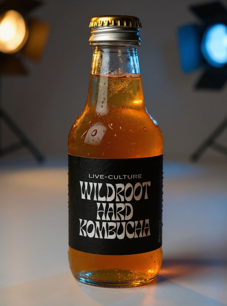
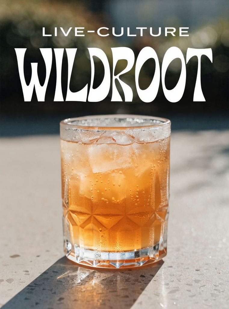
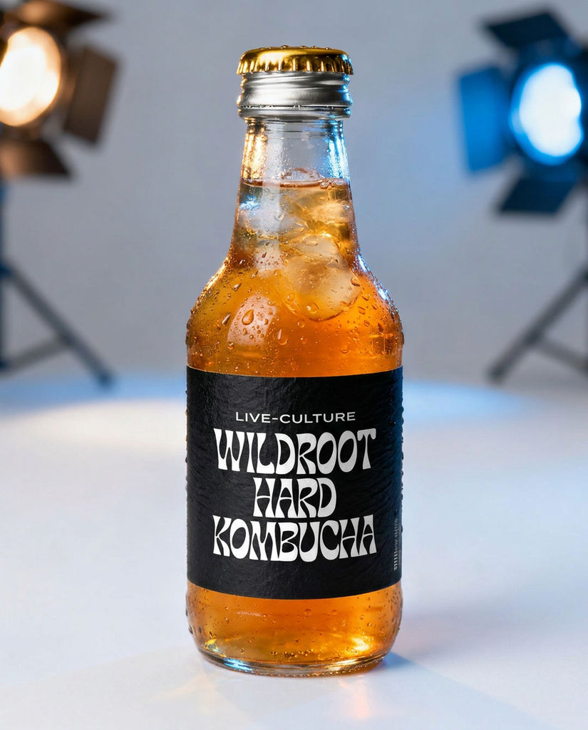
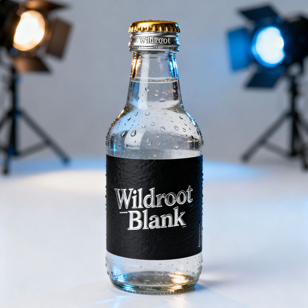
Start from a product idea and the Technique returns a print-ready label design plus a photoreal packshot of the finished bottle.

CPG Brand Launches
CPG founders design a product label for a new launch and get a photoreal packshot in the same run, enough to judge shelf appeal before committing to a print order.

Flavor and Variant Ranges
Beverage and food teams run the Technique once per flavor to explore label design directions for a full range before picking the one that carries the line.

Packaging Design Concepts
Packaging designers and studios generate label concepts to put in front of clients early, then move the output to the FLORA canvas for refinements.
How to use Techniques?
Discover how to utilize Design A Product Label for different scenarios.
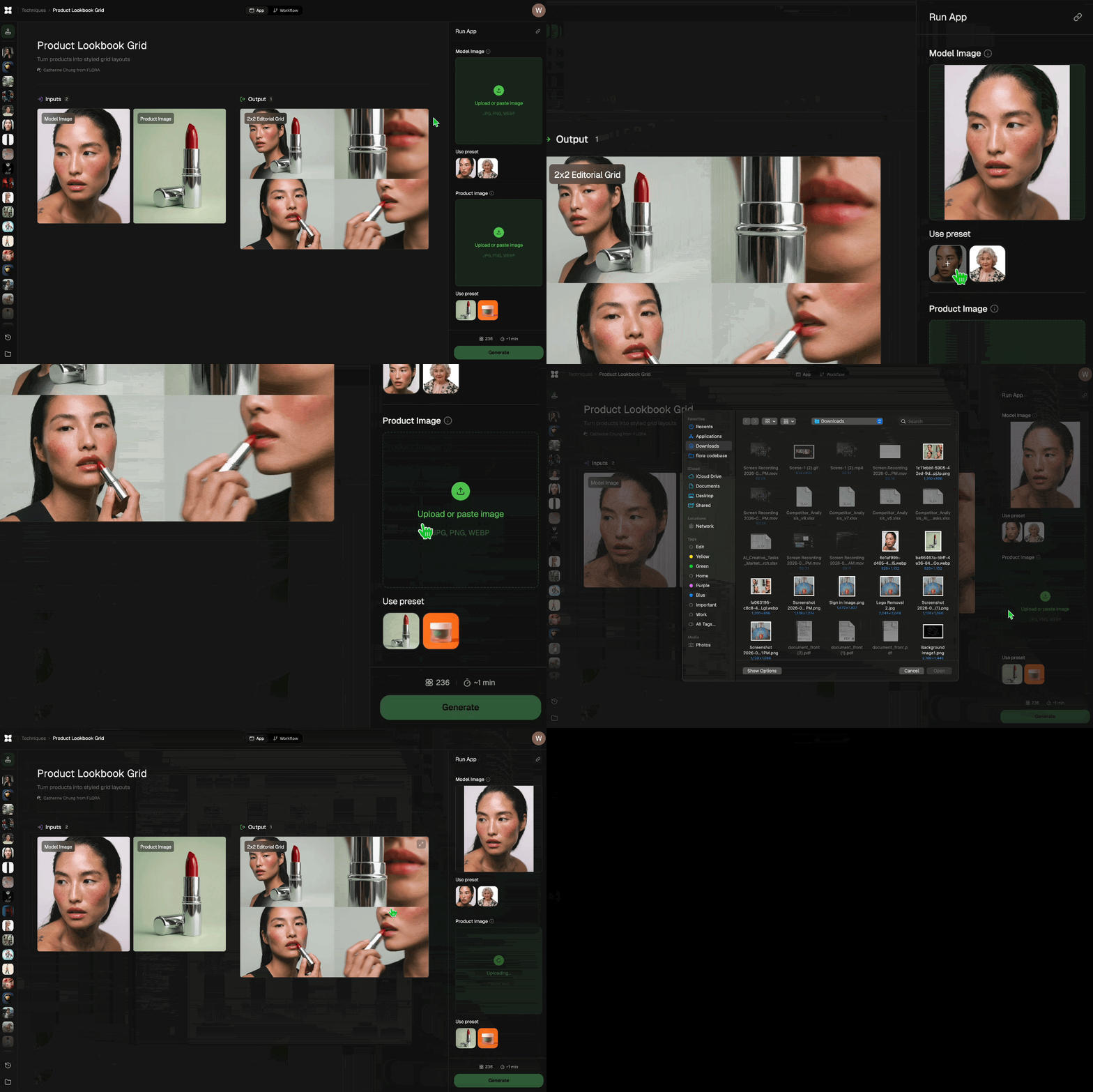
Add inputs
Upload images, videos, or type in the prompts to get started.
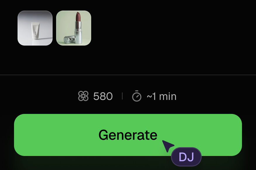
Generate outputs
Next, hit the "Generate" button to start generating your outputs.
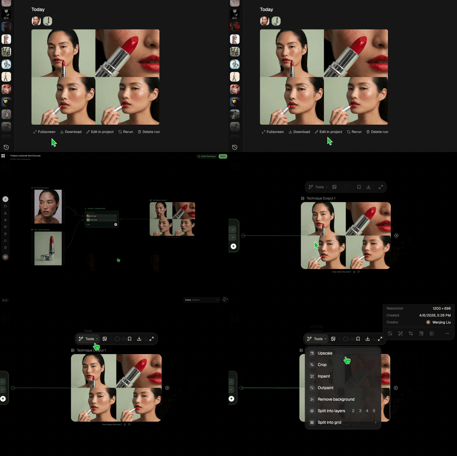
Edit and export
Refine your outputs on canvas, or download them directly.
Frequently asked questions
All you need to know about Design A Product Label
What it takes to design a product label that holds up on a shelf
To design a product label, you have to fit a brand identity and a set of mandatory information onto a few square inches of curved surface that will be printed, wrapped around a container, and glanced at by someone walking past. Label work rarely behaves like a poster or a social asset for that reason. Plenty of first drafts look resolved on a laptop and then come apart once they are on a bottle.
The Design a Product Label Technique starts from the product and returns label artwork together with a view of that label applied to the container. You can run it from a free account at FLORA. The two outputs are useful for different reasons. Flat artwork shows you whether the composition holds together on its own, while the dressed view shows you how it behaves on the object it was made for.
Everything a label has to carry before any of it looks designed
Most of the work happens before anything looks designed. A label is a fixed amount of surface carrying a fixed amount of obligation. Somewhere on it you need the brand mark, the product name at whatever size makes it the first thing read, the variant or flavor descriptor, the net contents, the ingredient or specification copy your category requires, and a clean rectangle of quiet space where a barcode will eventually sit. There are no optional entries on that list, and every item on it is competing for the same inches.
That pressure is what makes label design behave differently from other graphic work. A poster can be generous with space, and the person looking at it has stopped walking. A label has neither advantage: curved surface, moving shopper, roughly a second of attention before the eye lands on whatever is sitting next to it. Under those conditions hierarchy is the main design problem you are solving rather than a stylistic question you get to answer last.
Why the first read has to happen from across the aisle
Designers arriving from screen work tend to over-detail the first pass, and it is the most common way to design a product label that photographs beautifully and then fails in the aisle. At 100% zoom on a monitor, a delicate serif and a four-line origin story look considered. The same label printed at actual size and shot from three feet back reads as a grey smudge with a logo on it.
There is a cheap way to check this. Shrink the artwork to roughly the size it will physically be, then get up and walk away from the screen. Whatever you can still identify from a few steps back is what the label genuinely communicates, and in most cases that comes down to a brand mark, a dominant color, and a word or two. The rest of the copy is for the person who has already picked the bottle up, so it should be designed for that closer second read instead of competing with the first one.
Color carries much of the distance read, especially across a range where each variant has to be told apart before any type is legible. Palette Pull can pull a usable set of colors out of a reference image if you are building the palette that anchors the system.
How the Technique gets from a product description to artwork
Your input is doing the work a brief would normally do when you design a product label this way. Category, name, the tone you are after, any reference image you supply: all of it shapes the result. The Technique itself runs on fixed settings, so there is nothing to adjust once it is going. The lever you have is the input.
Adjectives get you less than specifics do. "Cold brew concentrate, single origin Ethiopian, matte black label, small confident wordmark" gives the Technique considerably more to work with than "premium coffee label." Naming the category is worth doing too, since the visual conventions of a hot sauce, a skincare serum, and a craft beer have almost nothing in common, and stating which one you are making pulls the output toward those conventions instead of some average of all three.
When a result misses, run it again on a rewritten input rather than trying to correct the one you have. Runs are independent, so three or four passes with different phrasing tends to land somewhere better than one pass followed by a lot of manual repair.
Why the mockup view changes which direction you keep
Seeing the label on the container reverses decisions fairly often. Artwork that looked balanced flat can lose its center once the surface curves away from the viewer, because the edges compress and the middle takes on more weight than you planned for. Type set near the left and right boundaries is usually the first thing to suffer. Layouts built around a strong central axis with generous side margins survive the cylinder better than ones that run edge to edge.
The dressed view also happens to be the version other people can respond to. Handing a client or a retail buyer flat artwork asks them to do the imagining. A photoreal packshot removes that step, and it doubles as a placeholder listing image while physical samples are still in production. White Background will isolate that packshot onto a clean marketplace-ready backdrop, and Image Upscaler adds resolution if the file needs to go bigger than it came out.
Where a flavor range gets difficult
Ranges are harder than single labels. The set has to read as one family from a distance while each item stays individually identifiable up close, and those two requirements pull against each other. Push the variation too far and the line stops reading as a line, while holding it too tight leaves shoppers reaching for the wrong flavor.
What works in practice is settling one label completely before generating anything else. Run the Technique per variant, then bring everything onto the canvas and look at the set together rather than judging each one on its own. Because runs are independent, the outputs will not arrive consistent with each other, and you should expect to pick a lead direction and pull the others toward it. Shifting color while keeping layout and type fixed is the version of this that usually holds up, and Product Recolor gets you those variants faster than regenerating each label from scratch.
Taking the output further on the canvas
Everything the Technique produces lands on the FLORA canvas, which is where the hands-on part of label design happens. Swapping a line of copy, adjusting a margin, dropping in the barcode block, or placing the packshot into a campaign layout all happen on the canvas rather than inside the Technique, alongside the 50+ models you can run in the same space.
Labels usually turn out to be the starting point for a lot of other assets. Brand Extension Generator takes the visual language you just settled on into the rest of the brand system, and Product Lookbook Grid turns a finished range into something you can put in front of people. Once the packaging is locked, the lifestyle and campaign imagery that follows a launch sits with the wider AI image generator.
Related techniques
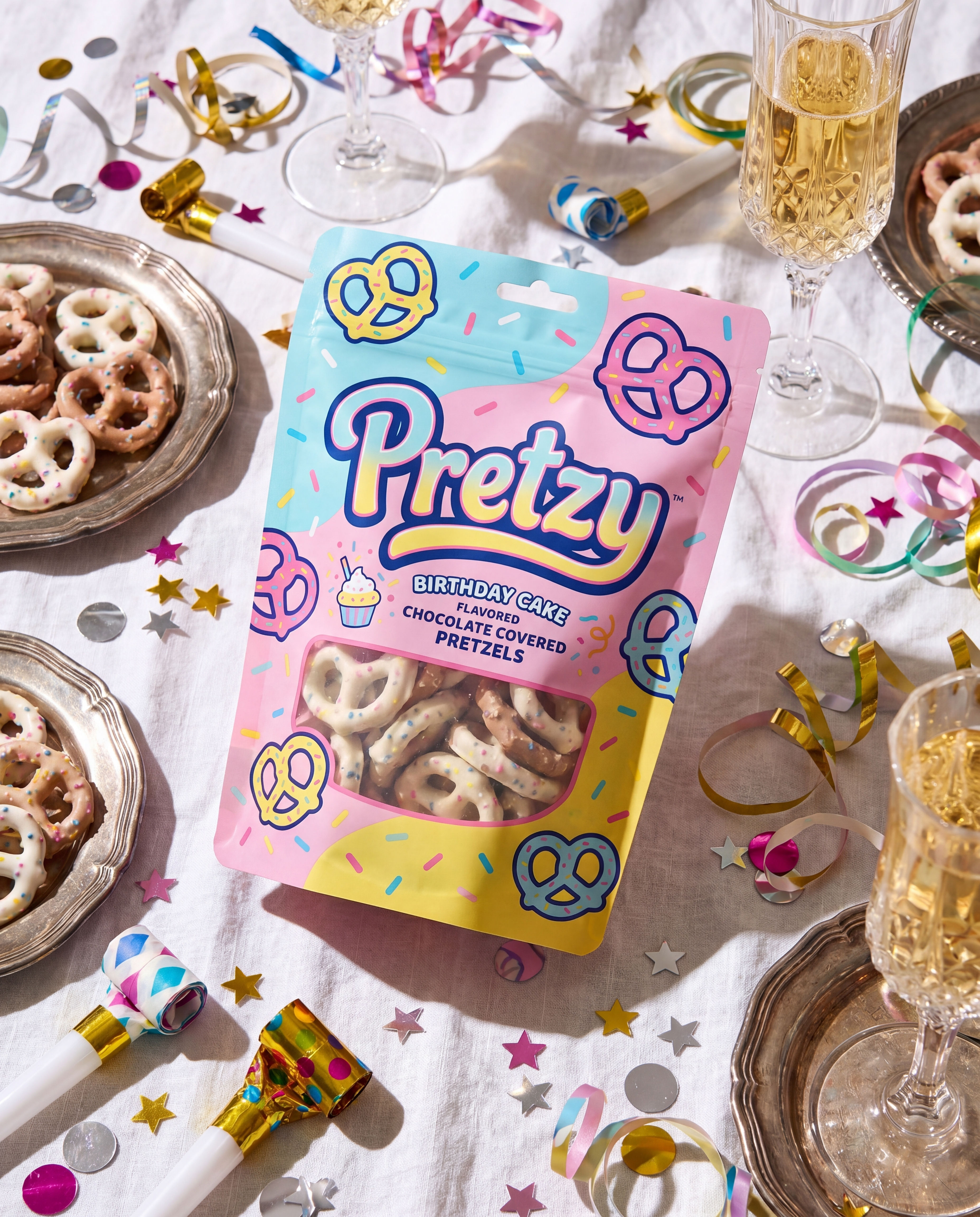 Product in Scene GeneratorCreate User Object Interaction (UOI) images of your product that can be used for e-commerce!
 Storytelling EngineIt takes a single approved key visual and instantly builds out a cohesive 9-frame editorial campaign treatment
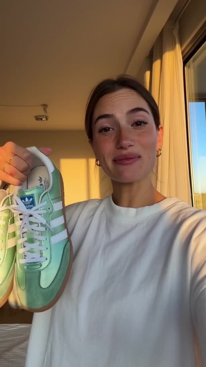 UGC CreatorCasual, phone-shot clips of your product
 Memoji MeTurn any face into a custom memoji
 RelightingRelights your photo
 Character LockOne character, 6 different angles
Design a Product Label and See It on the Bottle in One Click
art a print-ready label from scratch, spin a full flavor range, then dress the real bottle. Useful for: CPG founders, brand & packaging designers, and small-batch makers who need a legible, on-shelf label plus a photoreal packshot without hiring a studio or fighting InDesign.

Louis Anderson