The Borderlands Art Style on an Original Character
 FLORA
FLORA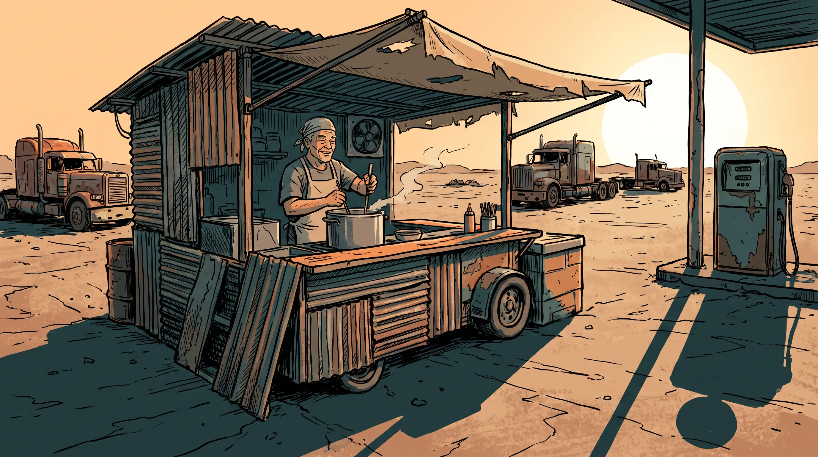
The Borderlands art style is the inked, comic-book look of Gearbox Software's shooter series, which started with the first Borderlands in 2009. It came late in the build. The 2007 reveal looked as dark and realistic as many sci-fi shooters of the time, and with the project about 75 percent done, the studio rebuilt its visuals to match the ink-lined concept drawings. On screen that means heavy black contour lines around every major shape, textures that look drawn by hand, and scratchy hatching where a realistic game would put a soft shadow. Color runs dusty and hot, with rust and sun-bleached orange set against a hard blue sky.
Borderlands art style examples made in FLORA
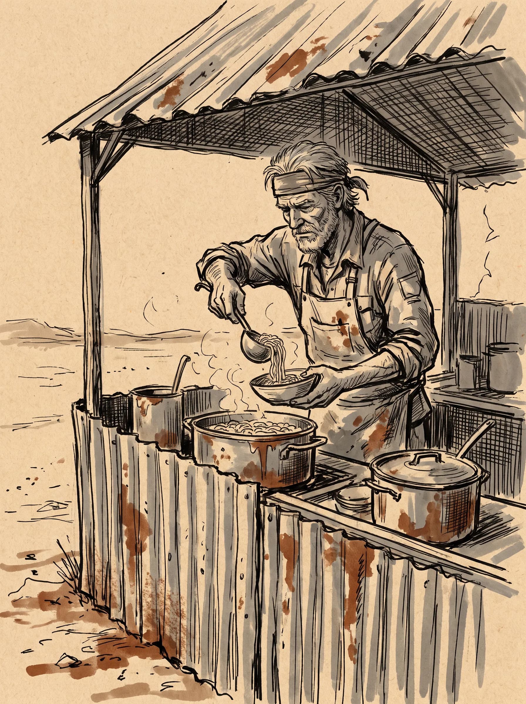
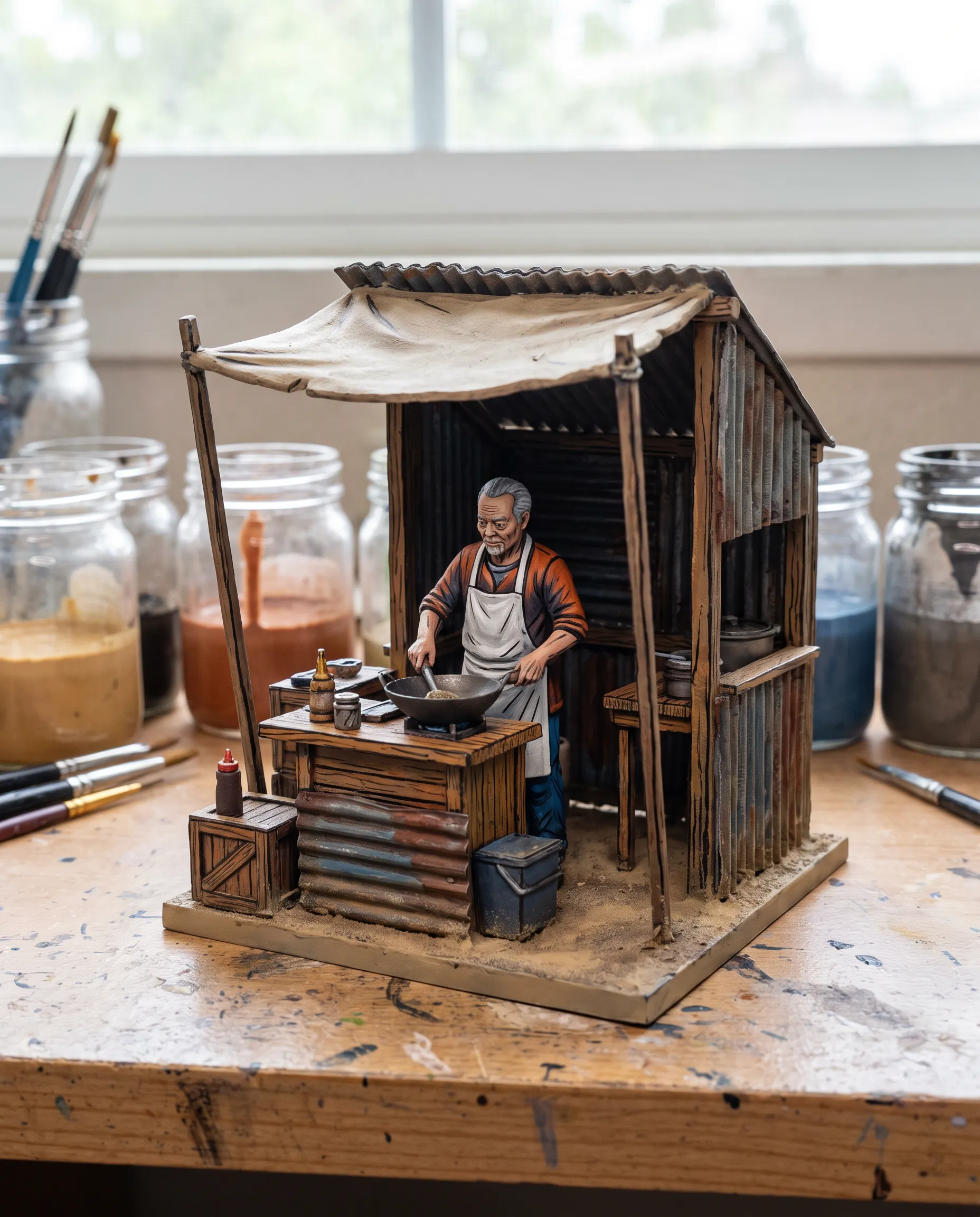
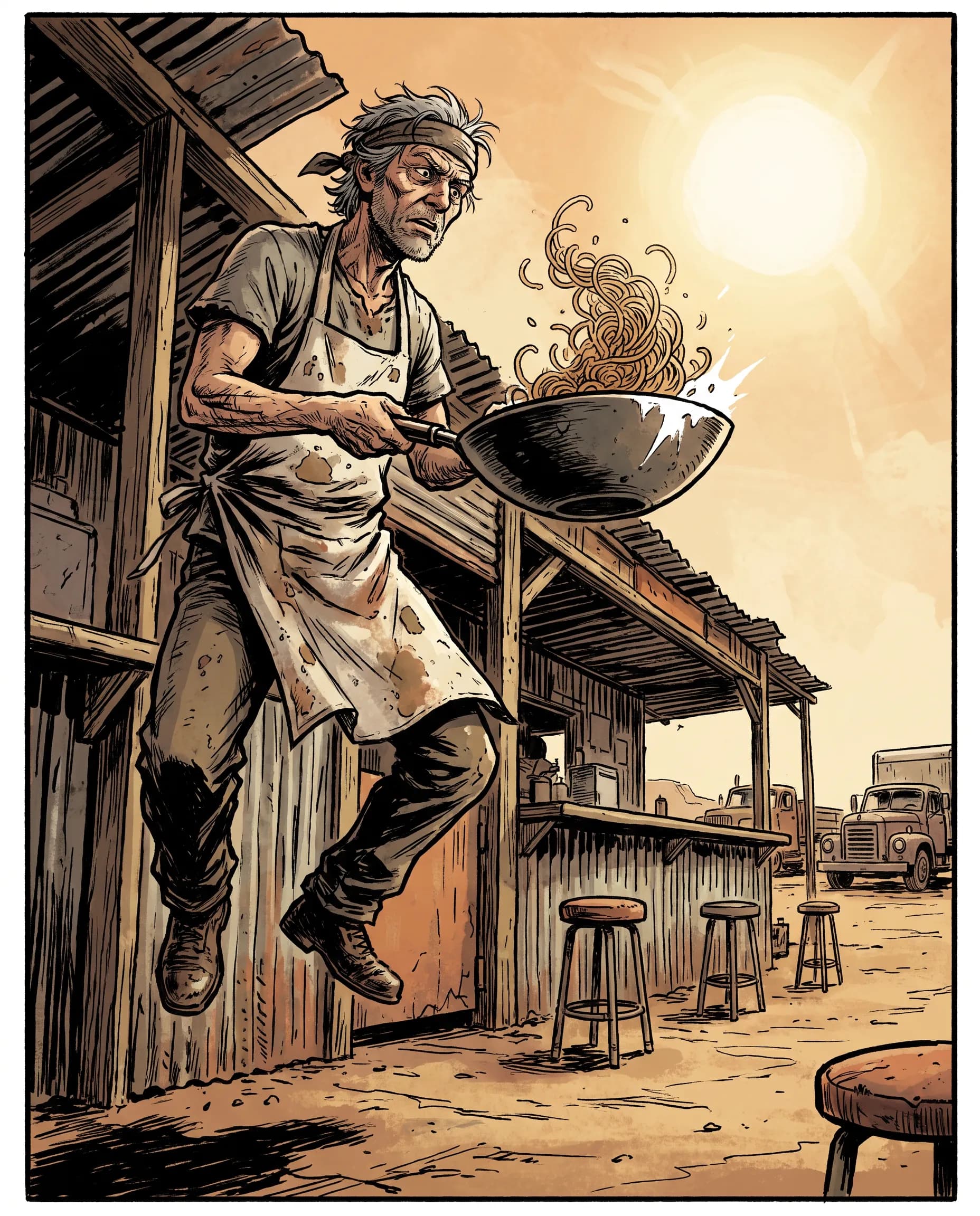
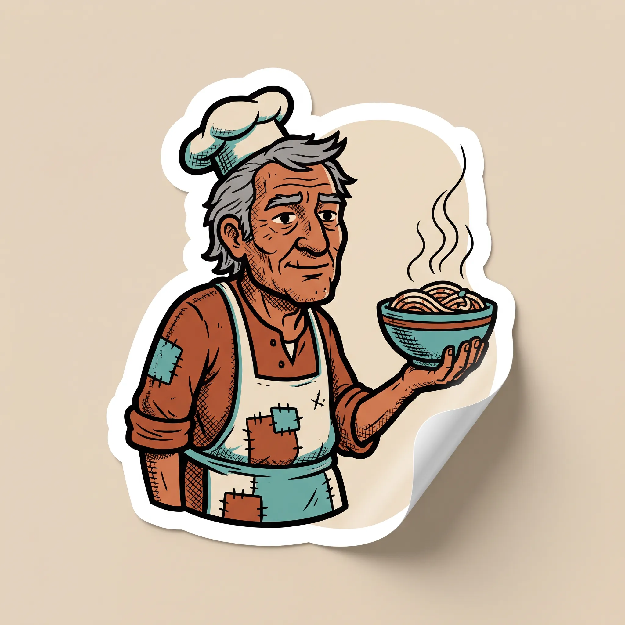
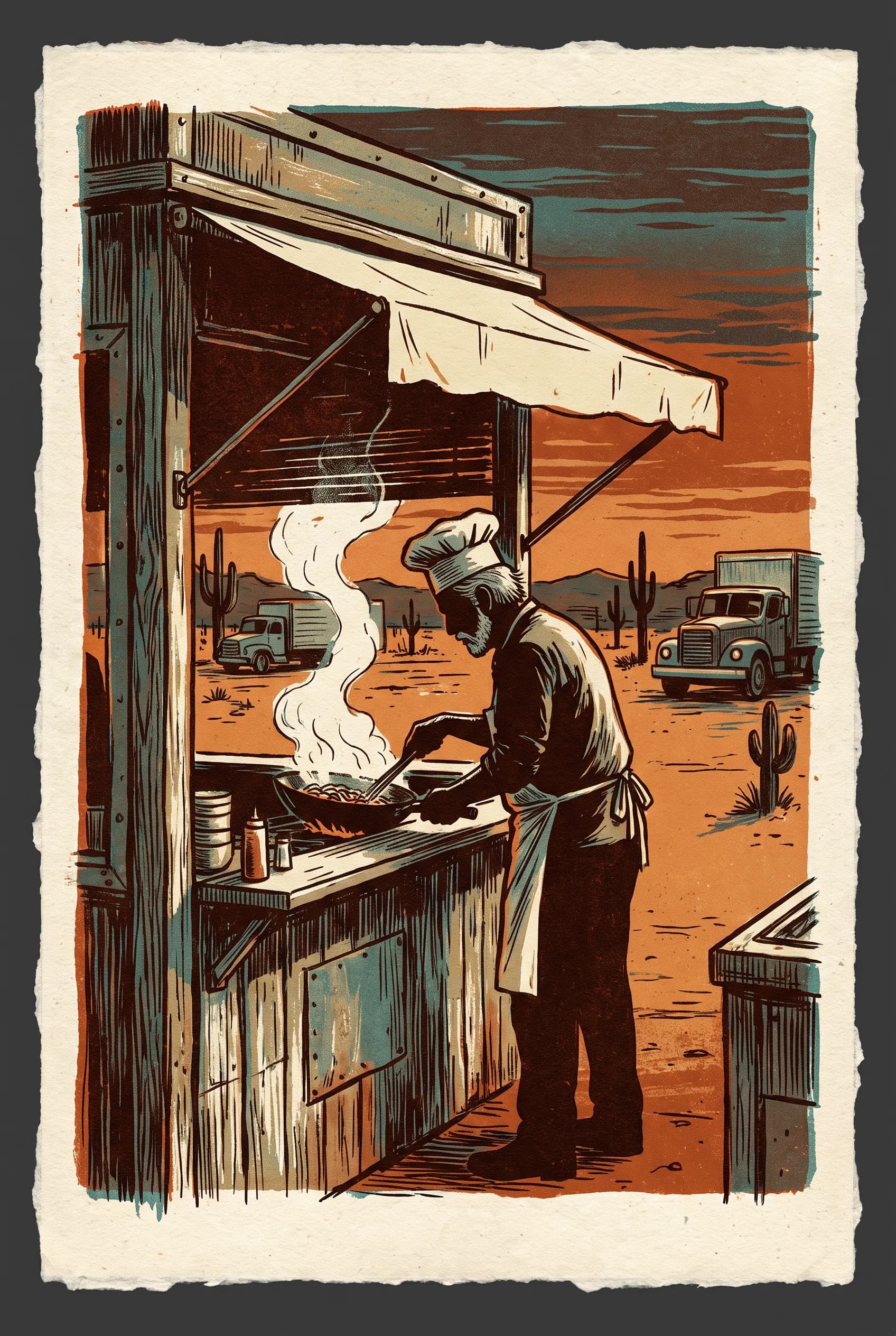
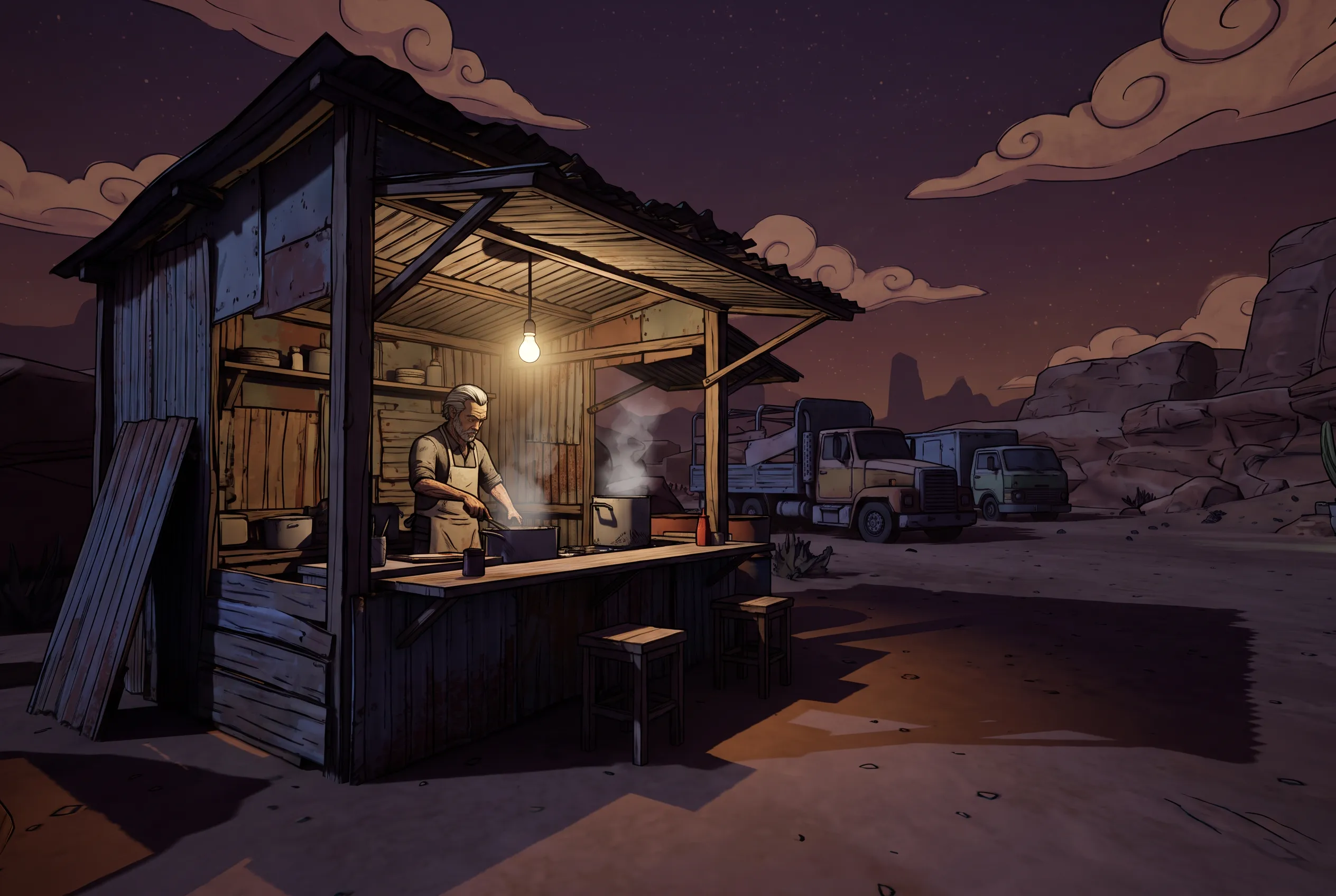
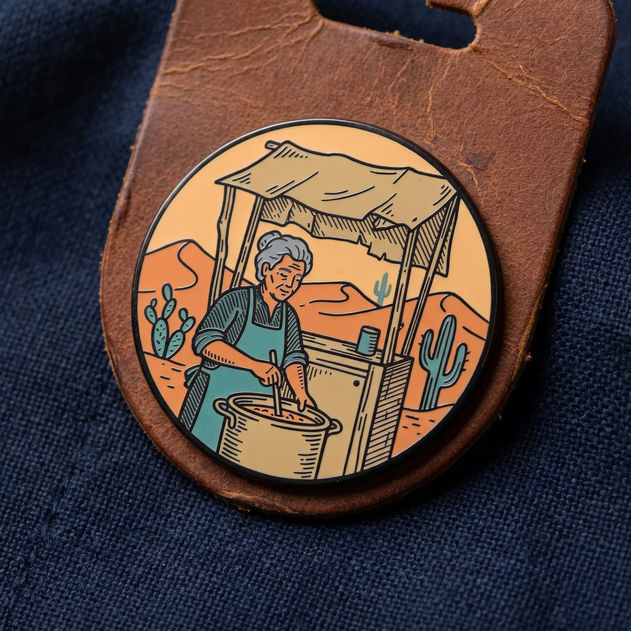
Our subject is an invented cook who runs a roadside noodle stall in the desert, shown in eight media with no franchise characters, logos or locations. Every picture came out of FLORA's AI image generator, captioned with its complete prompt.
How to prompt for Borderlands art style
Give the subject in a few words, then set the line with thick black ink outlines of uneven weight around the silhouette and the big interior shapes. Texture is next. Hatching and scratchy crosshatch on metal, cloth and skin carry much of the effect. Keep shading to two tones with a hard edge between them. Light deserves one deliberate choice. Gearbox wrote a moon that never moves into the game's fiction so every level had one light that stayed put, and the shadows came out dramatic. A prompt can borrow that by naming one hard light direction.
A common answer to what art style is Borderlands is cel shading, the label early press coverage used in 2009. As a prompt word it can steer a model toward clean anime frames with no ink texture, so pair it with outline and hatching cues. Naming the game, or the Borderlands 2 art style in particular, can also pull the franchise's own characters and logos into the frame. Describe the traits and leave the title out.
Copy-ready prompts
- Key art. Wide game key art of a gray-haired cook running a roadside noodle stand at a desert truck stop, thick uneven black ink outlines, hand-drawn hatching on rusted metal and a canvas awning, two-tone hard-edged shading, sun-faded orange and teal palette, one low sun casting long solid shadows, no text
- Concept sketch. Ink concept sketch of a gray-haired desert truck-stop cook ladling noodles at his stand, bold brush outlines, scratchy crosshatching, gray marker shadows, splashes of rust orange, toned paper, no text
- Painted miniature. Painted resin miniature of a gray-haired noodle cook at a desert truck-stop stand with no signs or banners, hand-painted black outlines on every edge, brushed hatching strokes in the shadows, flat saturated colors, photographed on a workbench beside plain glass paint jars with blank lids and no labels in soft daylight, no text
Common misfires
Outlines fail first. A model may thin them out or skip them on interior shapes, and the image can drift toward a polished digital painting; asking for uneven ink weight on every edge usually brings them back. Overdo the hatching and the frame fills with scratches while the forms go flat, so keep it on the shadow side. Faces can also tip into rubbery caricature. At Gearbox, pairing a comic book artist with the lead character designer is what gave the characters a stylized look that stops short of cartoon.
Where Borderlands art style works
Game pitches usually need the hero drawn from every side before anyone models it. Describe that character once in the Character Creator and it returns turnaround views, an alternate outfit, a name card and a short idle loop.
Borderlands style art also holds up very small. A thick contour still reads at thumbnail size after fine rendering has turned to mush. Give the AI movie poster generator a film concept, title, genre and tagline and it returns a hero poster with the title already set, plus campaign variations.
Related styles
- Comic art styles, where the inking comes from
- Gorillaz art style, another grimy look drawn with heavy comic-book ink
- Cartoon art styles swap hatching for round shapes
- Video game art styles, the wider family that this page is one entry in
- 3D art styles, including the toon-shaded renders this one gets filed under
FAQs
What is Borderlands art style called?
Gearbox's own Borderlands art style name is "concept art style," the label it used when the rebuilt game resurfaced in early 2009. That spring the studio explained why the look isn't quite cel shading, a stance an April 2009 Destructoid headline boiled down to "not cel-shaded actually."
What was Borderlands inspired by?
Randy Pitchford, Gearbox's CEO, later acknowledged the new look owed part of its idea to Codehunters, a short film by Ben Hibon. Gearbox had approached Hibon about artwork, and he has said those talks went nowhere. The game itself began in 2005 with a short pitch, "Halo meets Diablo."
What aesthetic is Borderlands?
It is comic-book sci-fi on Pandora, a planet the story fills with barren wasteland and industrial junk heaps. The realistic version that came before had a brown, muted palette. Gearbox's leads later called that phase the "Brown Period," and in-house testers felt it looked too close to Fallout 3. That grim surface also clashed with gameplay full of huge vehicle jumps and exploding enemies.