Graphic Art Styles from Swiss Grids to Psychedelic Swirls
 FLORA
FLORA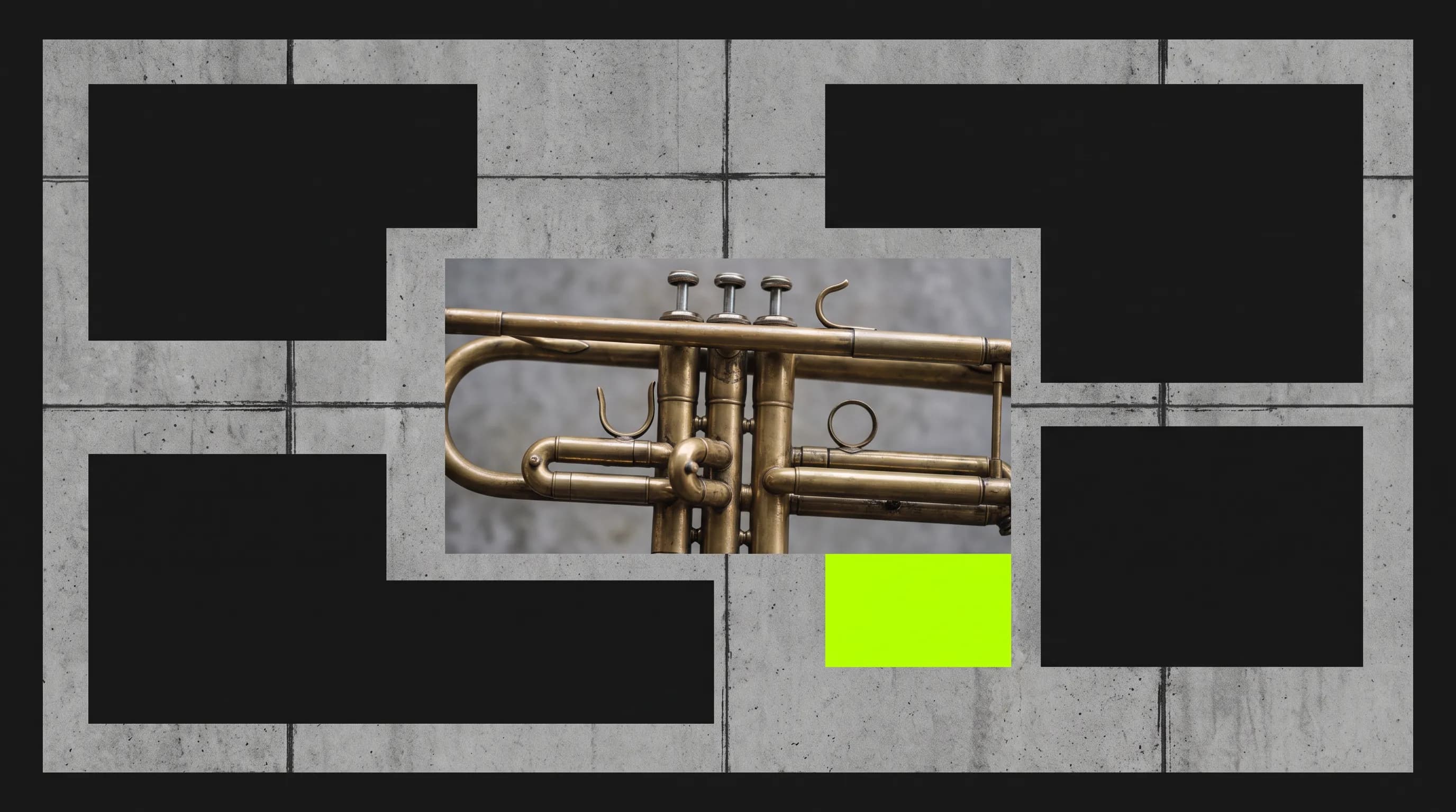
Graphic art styles are the named looks of graphic design, a field Britannica defines as arranging type and images so a message reaches its audience. Most of the names are 20th century. The Bauhaus, a German school opened in 1919 under Walter Gropius, merged the modern art movements of its day into one design program, and after World War II Swiss and German designers hardened that thinking into the International Typographic Style. Rock posters for 1960s New York and San Francisco venues swirled the other way, and screens have since added flat and brutalist looks. Forms shrink to plain geometry or a single silhouette. Color sits in flat planes, and the layout itself carries meaning.
Graphic art styles examples made in FLORA
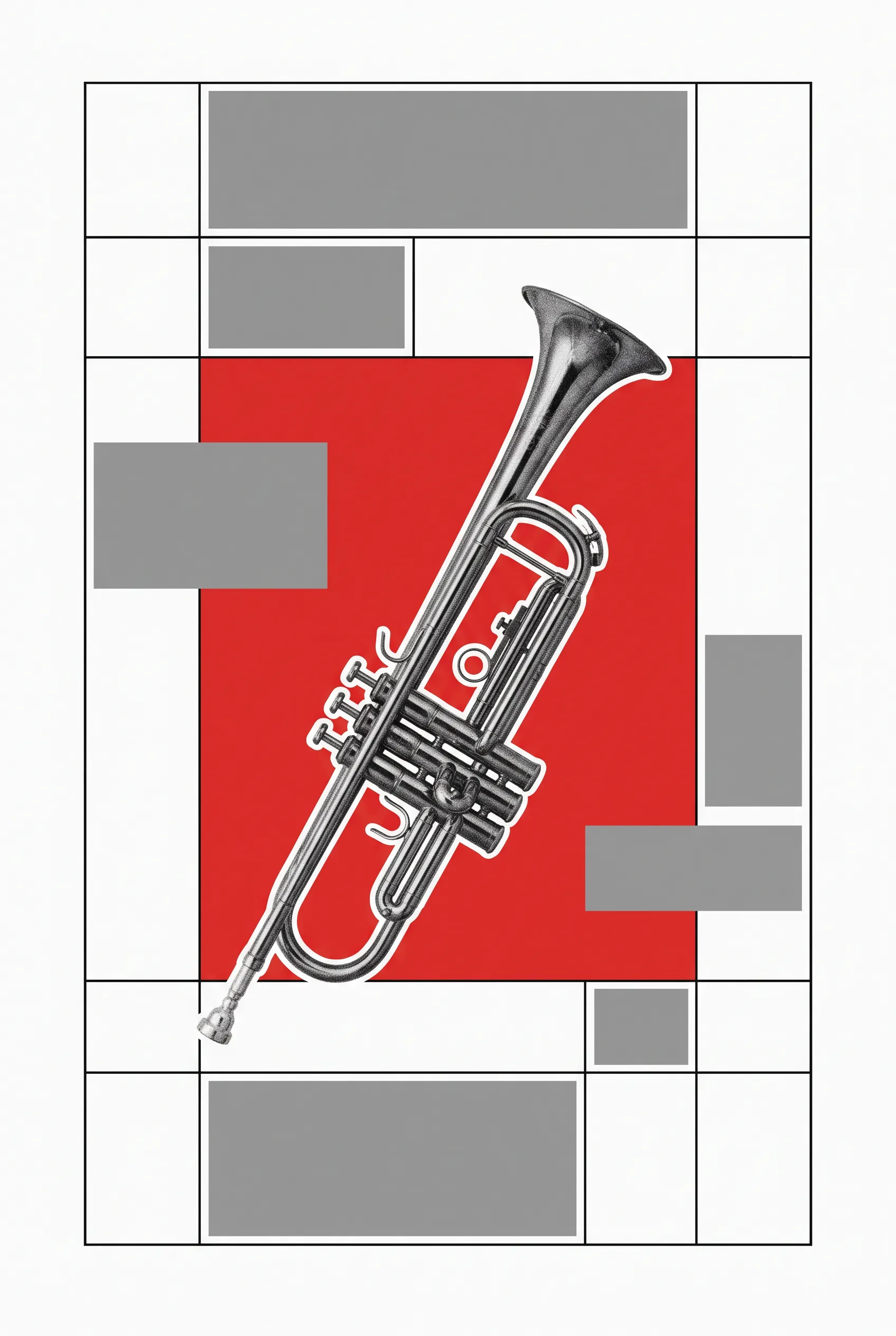
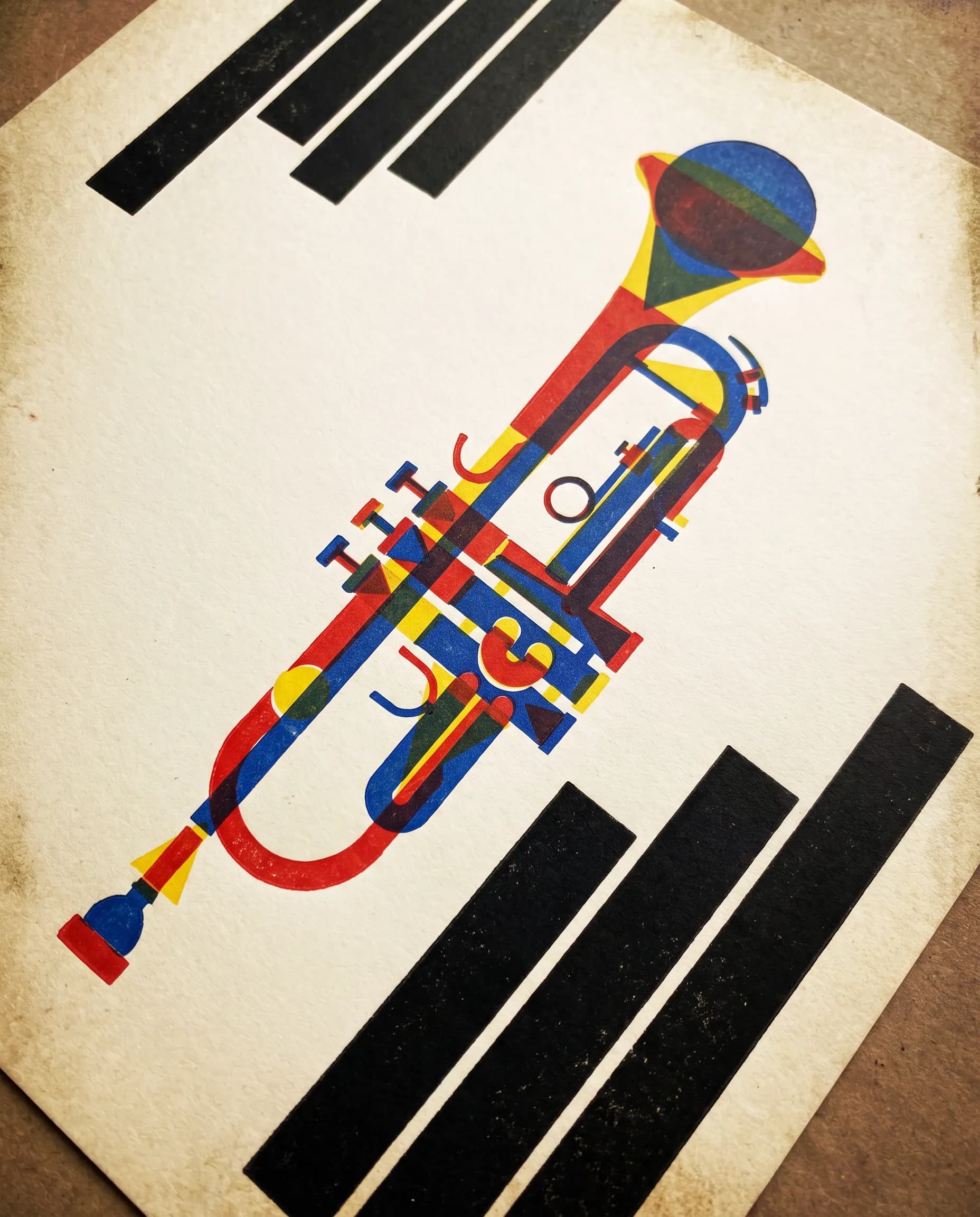
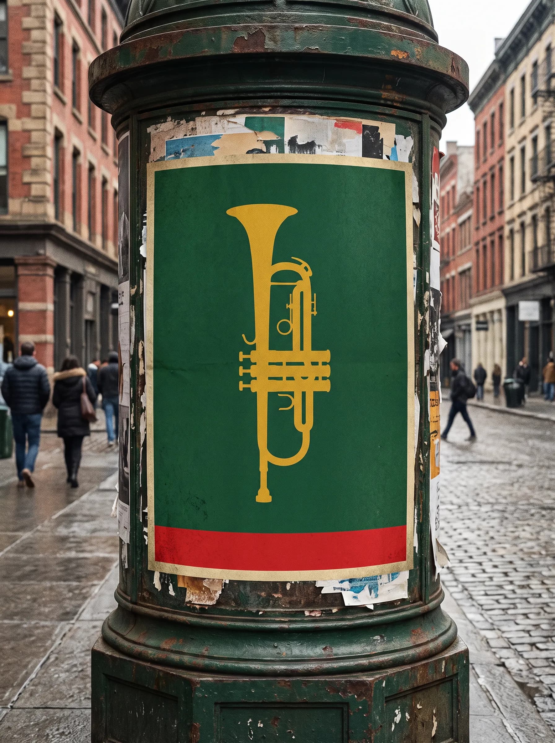
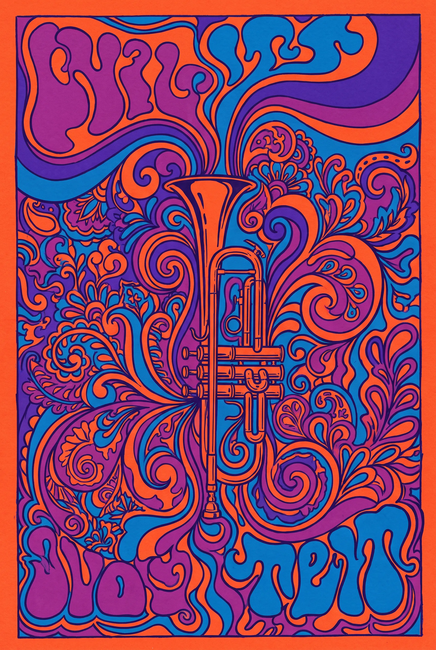
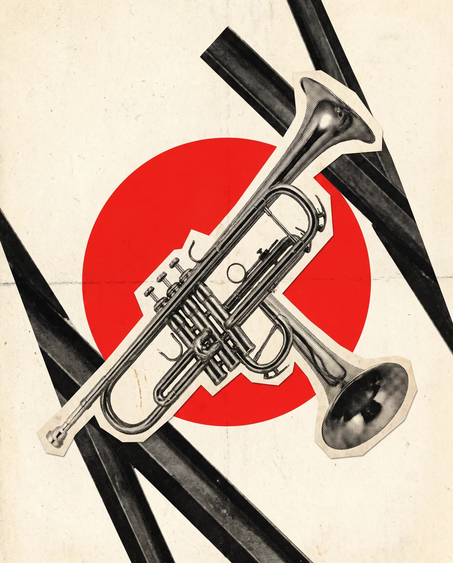
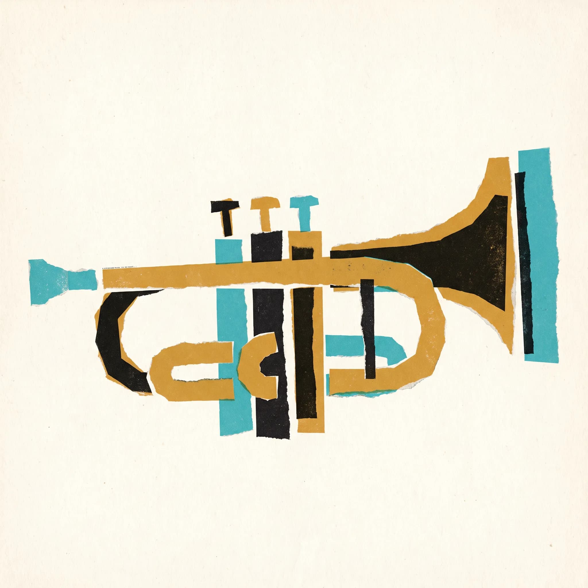
Music gave two of these schools some of their defining posters, Josef Müller-Brockmann's Zürich concert series and the 1960s rock bills, so a brass trumpet anchors all eight images. FLORA's AI image generator made each one, with its prompt underneath.

How to prompt for graphic art styles
Name the school first. Each has its own rules, and a model handed two at once tends to split the difference, so keep to one graphic art style per prompt. Swiss work wants an off-center layout on a strict grid around one cut-away photo. Bauhaus prompts respond well to primary colors and a diagonal tilt, while a psychedelic poster needs curves that crowd every corner in two clashing hot colors. Then add the subject and a short palette. Name the print process too, since offset ink and silkscreen leave very different surfaces. Lighting hardly matters on flat paper.
People also search for these looks as art design styles, a looser label that sweeps in illustration too. Words from print history, such as grid and photomontage, tend to steer a model better than either label.
Prompts for Swiss, Bauhaus and psychedelic work
- Swiss. International Typographic Style concert poster featuring a brass trumpet, cut-out photo placed off-center on a modular grid, flat red field, wide white margins, thin black rules and gray blocks where type would sit, offset print, no text
- Bauhaus. Bauhaus-style letterpress print of a brass trumpet built from circles, triangles and rectangles, red, yellow and blue with black on cream paper, composition tilted on a diagonal, solid black bars in place of lettering, no text
- Psychedelic. Psychedelic 1960s rock poster with a brass trumpet dissolving into swirling Art Nouveau curves, clashing orange and electric violet, dense hand-drawn ornament filling the frame, flowing abstract shapes where lettering would go, silkscreen inks, no text
Where the schools blur
Fake lettering is the usual problem. Posters are organized around type, and models often fill empty grid cells with letters that spell nothing, so describe gray bars or thin rules where the words would go. A Swiss prompt can also slide into generic minimalism with the object dead center. Restating the asymmetry usually fixes it. Muddy psychedelic results usually mean too many colors, so name two complements. Paper texture can flatten a glossy Bauhaus print.
Where graphic art styles work
Visual identity is where the Swiss style ended up. Britannica notes that multinational companies adopted its standardized marks and typefaces along with its grid formats for signs and publications. Give the free logo maker a brand name and a short description of the mark and it returns a primary lockup, an icon mark, mono variants and a vector file. The AI brand kit generator goes further. Feed it a logo with a pattern and a type sample, and it lays them out as a seven-panel identity board.
Film work rewards the same habit of reduction. Saul Bass's titles for the 1959 film Anatomy of a Murder split a lying figure into parts that slid onto the screen and locked together. The AI movie poster generator takes a written film concept, title and tagline and returns a hero poster with the title set, plus campaign variations.
Related styles
- Art deco style, the decorative geometry that ran alongside the Bauhaus
- Psychedelic poster artists of the 1960s borrowed curves from art nouveau style
- 80s art style, for Memphis squiggles and airbrushed chrome
- Corporate art style, flat vector people drawn for tech brands
- Illustrative art style, the picture-making half of commercial art
FAQs
What are some common graphic art styles?
Common graphic design art styles include Swiss, Bauhaus, flat, psychedelic and brutalist. Two older ones appear in the gallery. Plakatstil, which Lucian Bernhard started with his first poster in 1905, reduced a product to one simple shape on a flat background color. Russian Constructivism built pages from plain geometry, as in El Lissitzky's 1923 design for Mayakovsky's For the Voice, where a large red circle stands for the sun on one poem's title page.
What are the 7 main types of graphic design?
There is no official seven, and some lists run to ten. Britannica names outputs instead, among them magazine pages, book jackets, postage stamps, packaging, trademarks, film titles and websites. The term itself dates to 1922, when typographer William A. Dwiggins coined it.
What are the types of graphic designers?
Sort them by what they make, such as identity, editorial pages, motion or illustration. Paul Rand worked in identity, with trademarks for IBM and UPS among others. Alexey Brodovitch art-directed Harper's Bazaar from 1934 to 1958, and Milton Glaser of Push Pin Studios worked as both designer and illustrator.